Ocas
From the oca to the logo.
About
Client
Scope
Strategy
Visual Identity
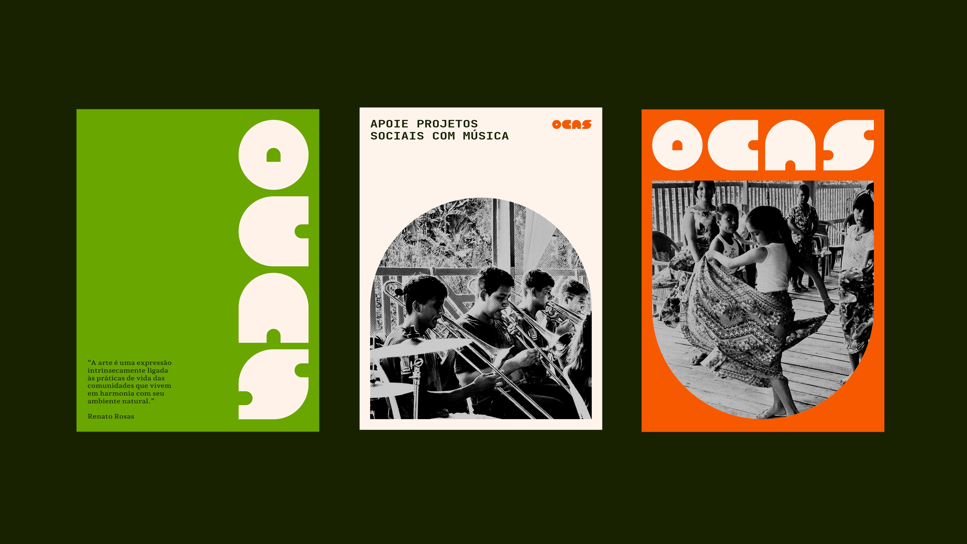
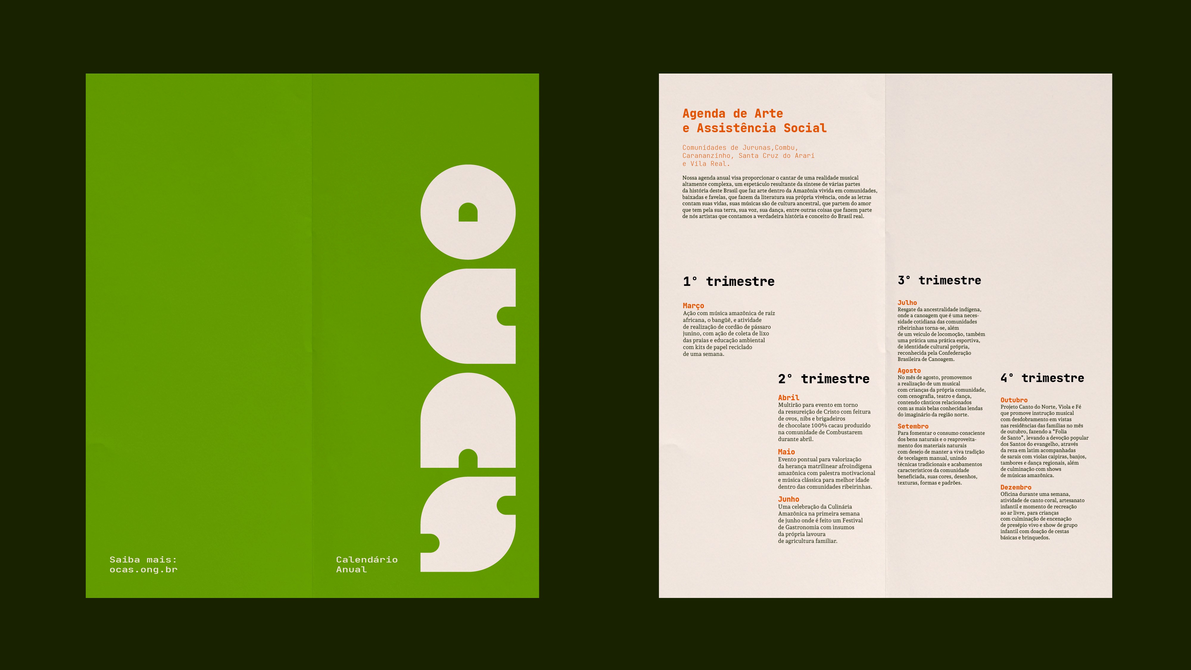
The shape of an Indigenous oca, a traditional dwelling, was the basis for the logo and the typeface of this social project in Pará.
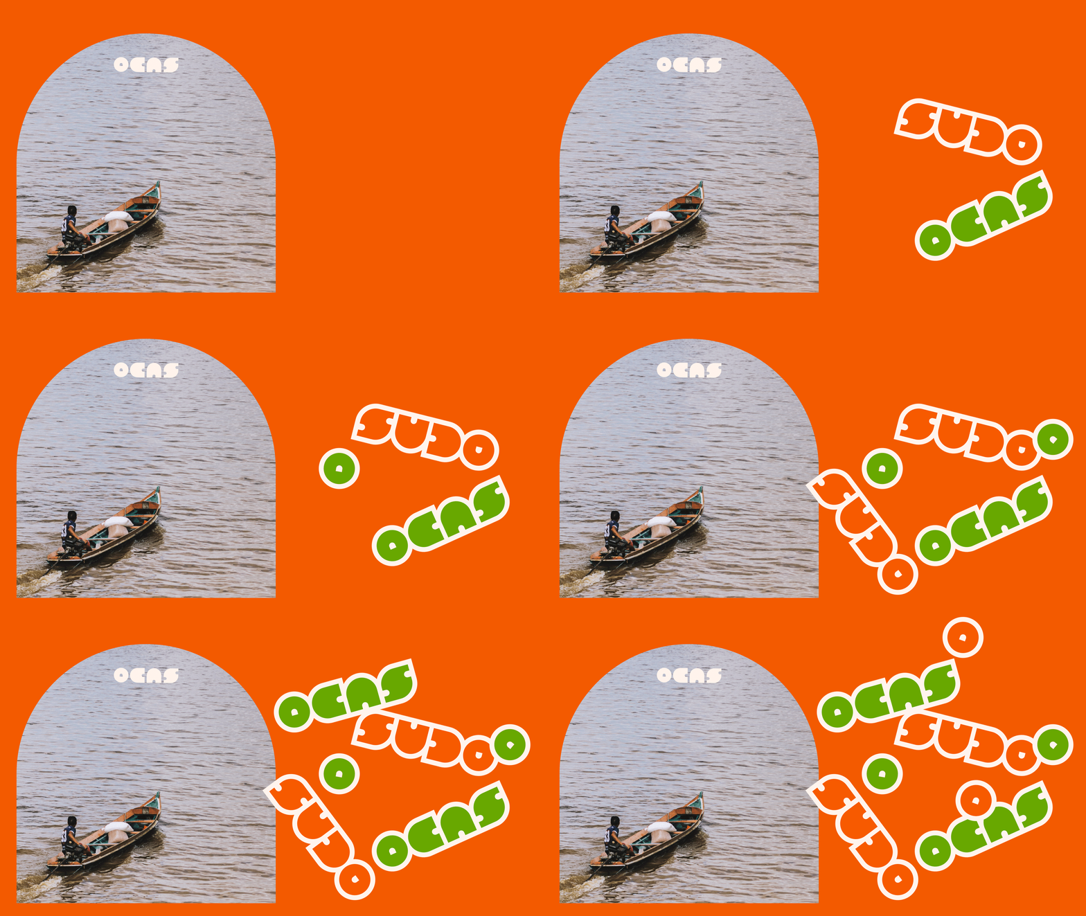
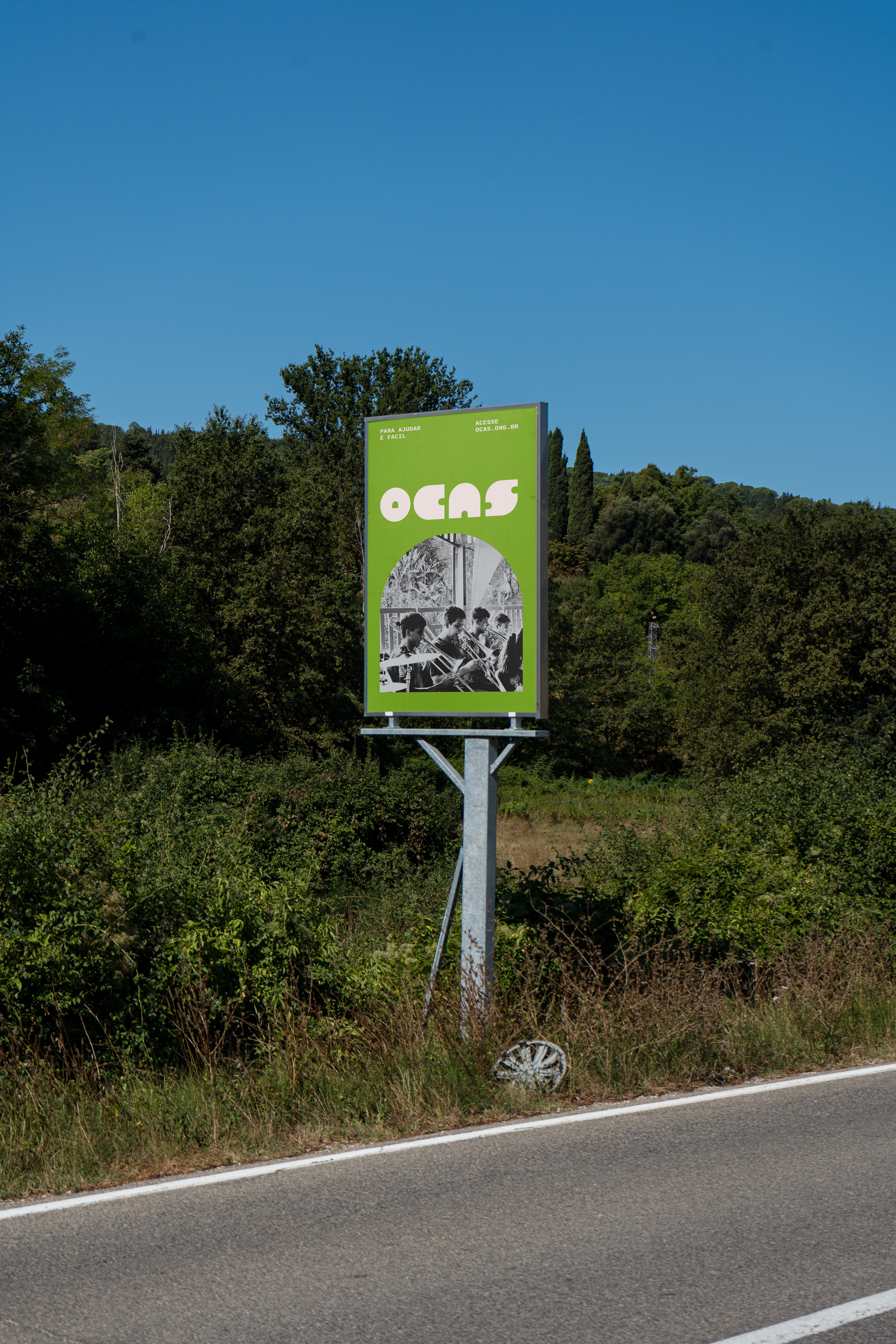
The door of the oca also inspired the frame used in photos and videos, in clear alignment with the visual identity. The Ocas case shows how effective communication builds credibility and respect for organizations when it has meaning, quality, and aesthetics.


" height="12px" id="naZLPfQHn" transform="translate(-1 0)" width="13px"/></svg>)