Cubo - Itaú
The future doesn't wait.
About
Client
Cubo - Itaú
Scope
Strategy
Visual Identity
Verbal Identity
Motion
Coding
Turning 10 is more than a celebration. It is an inflection point.
Keep talking about the past, or make room for the future?
The new Cubo Itaú comes out of that shift.
More than an innovation space, Cubo establishes itself as a living ecosystem that builds futures collectively.
The rebranding was designed to reflect this new moment: a dynamic, living visual system that translates the movement of those who believe that innovating is what builds a country's future.
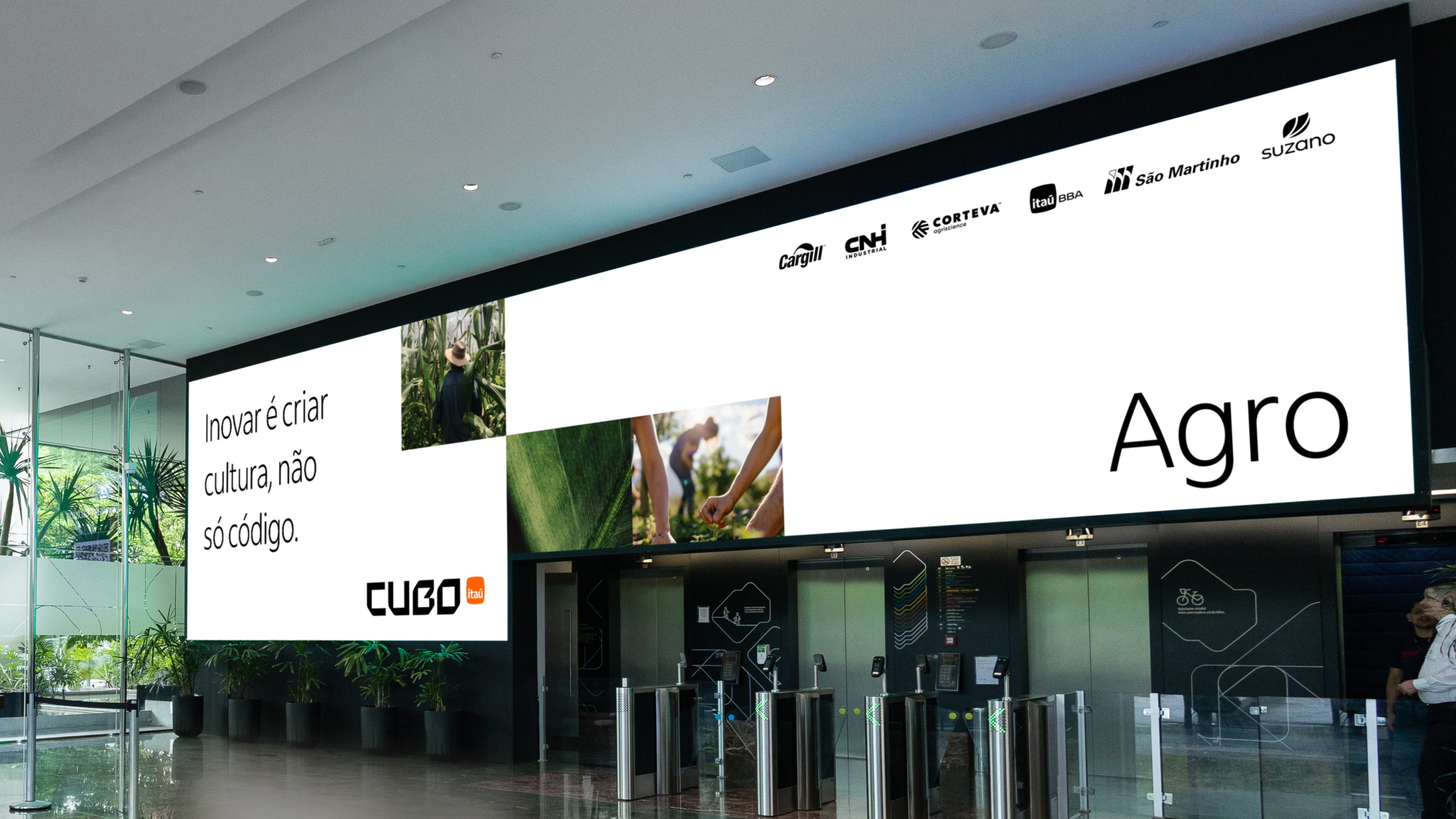

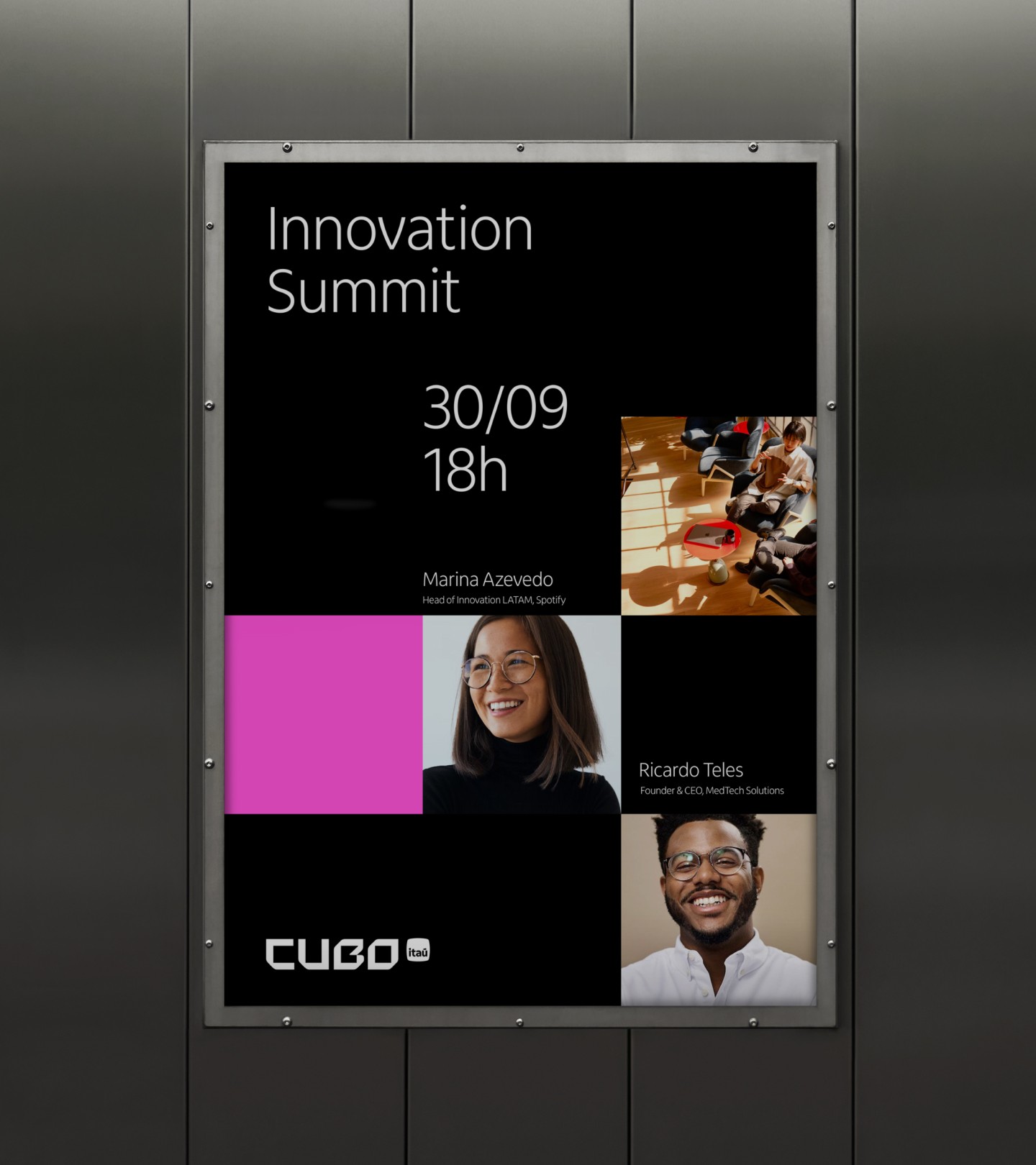
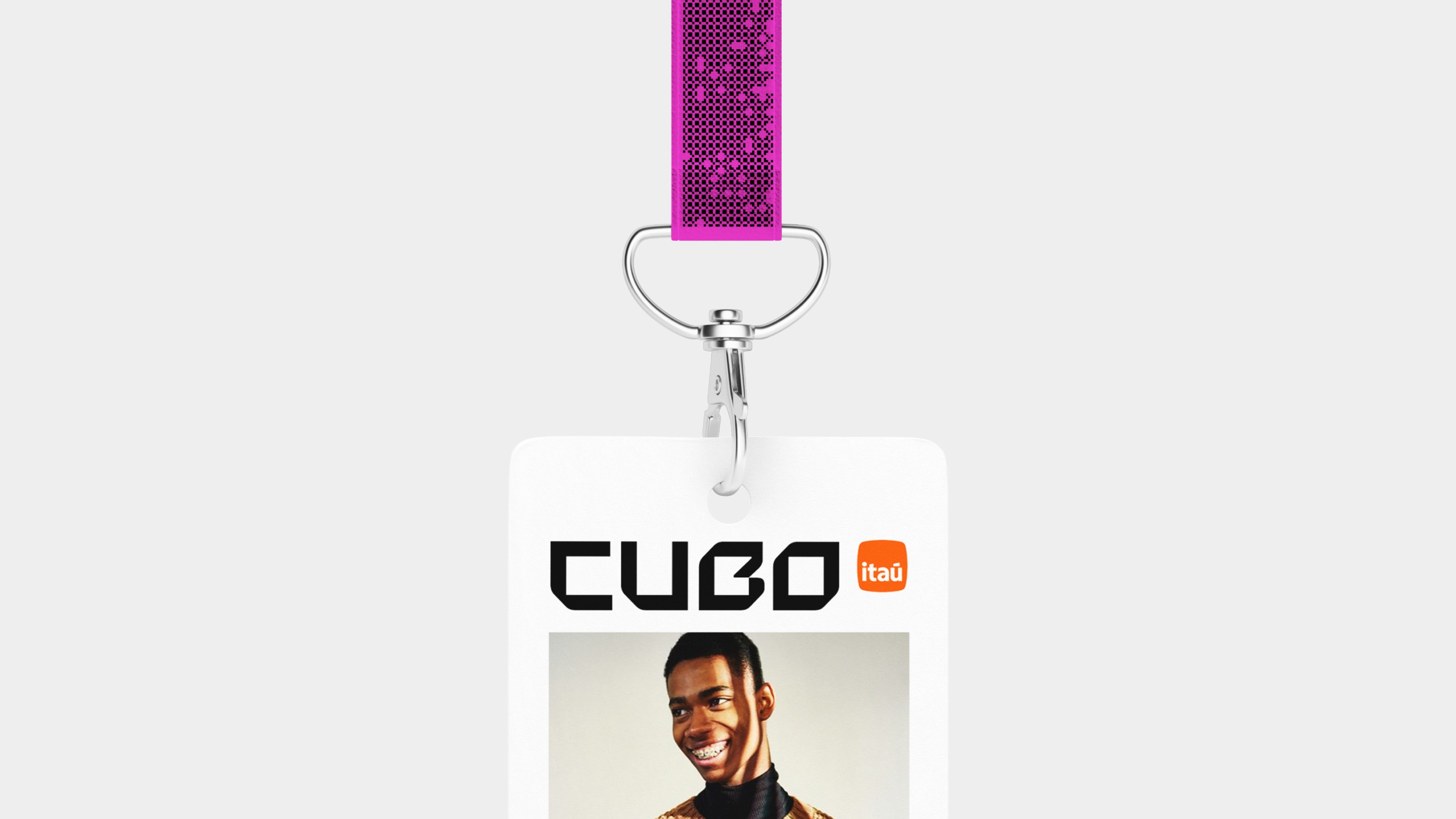
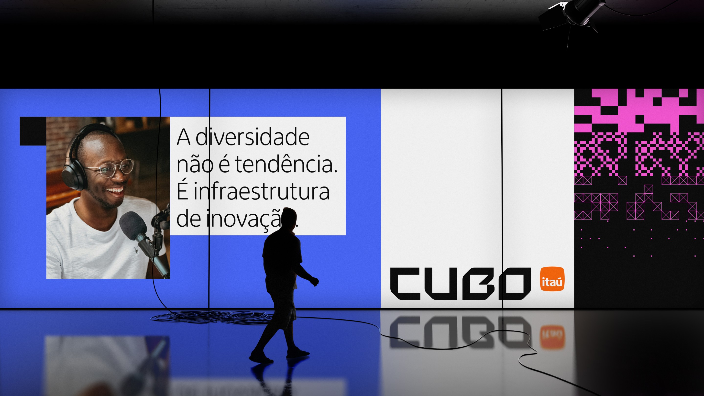

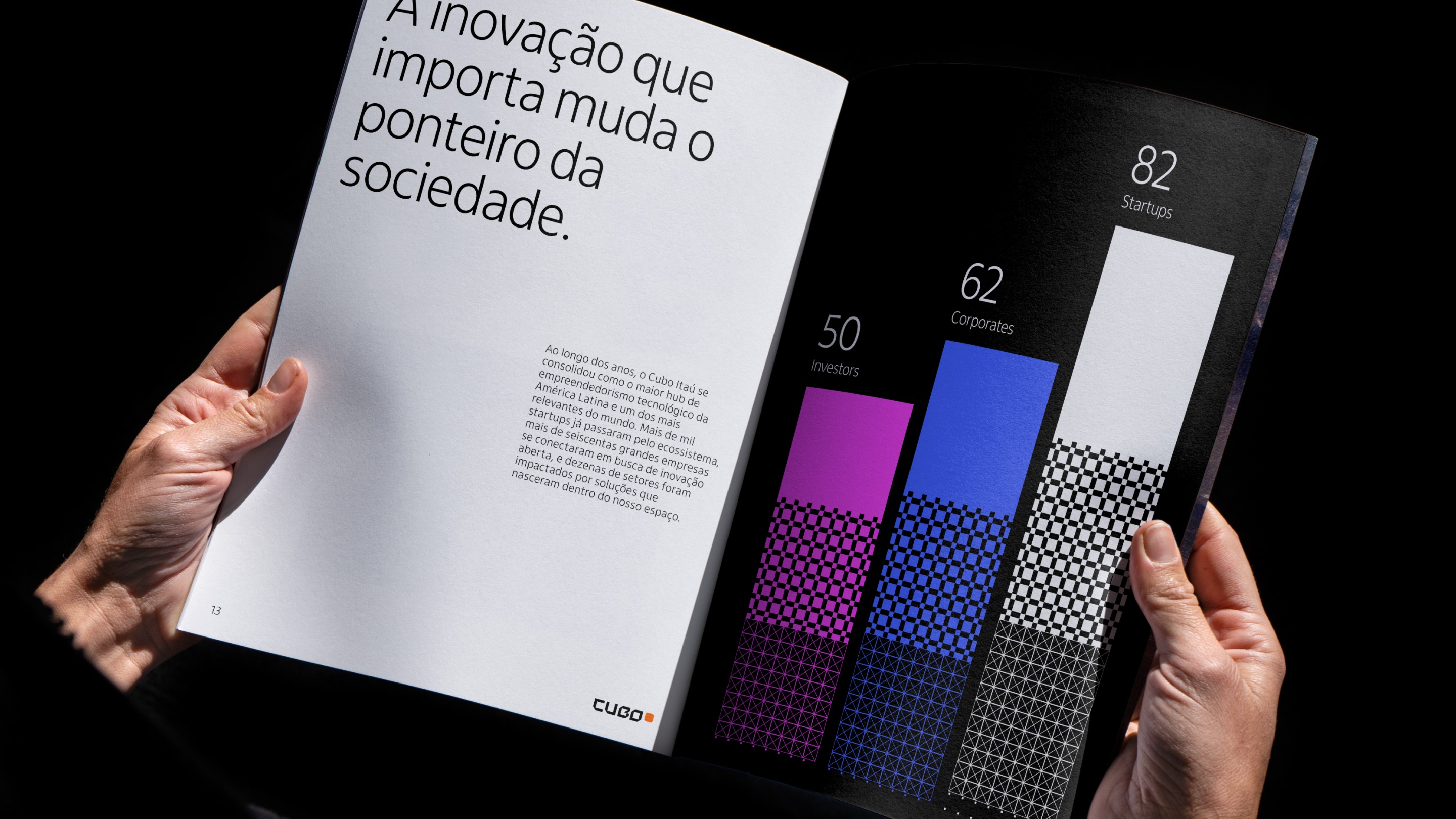
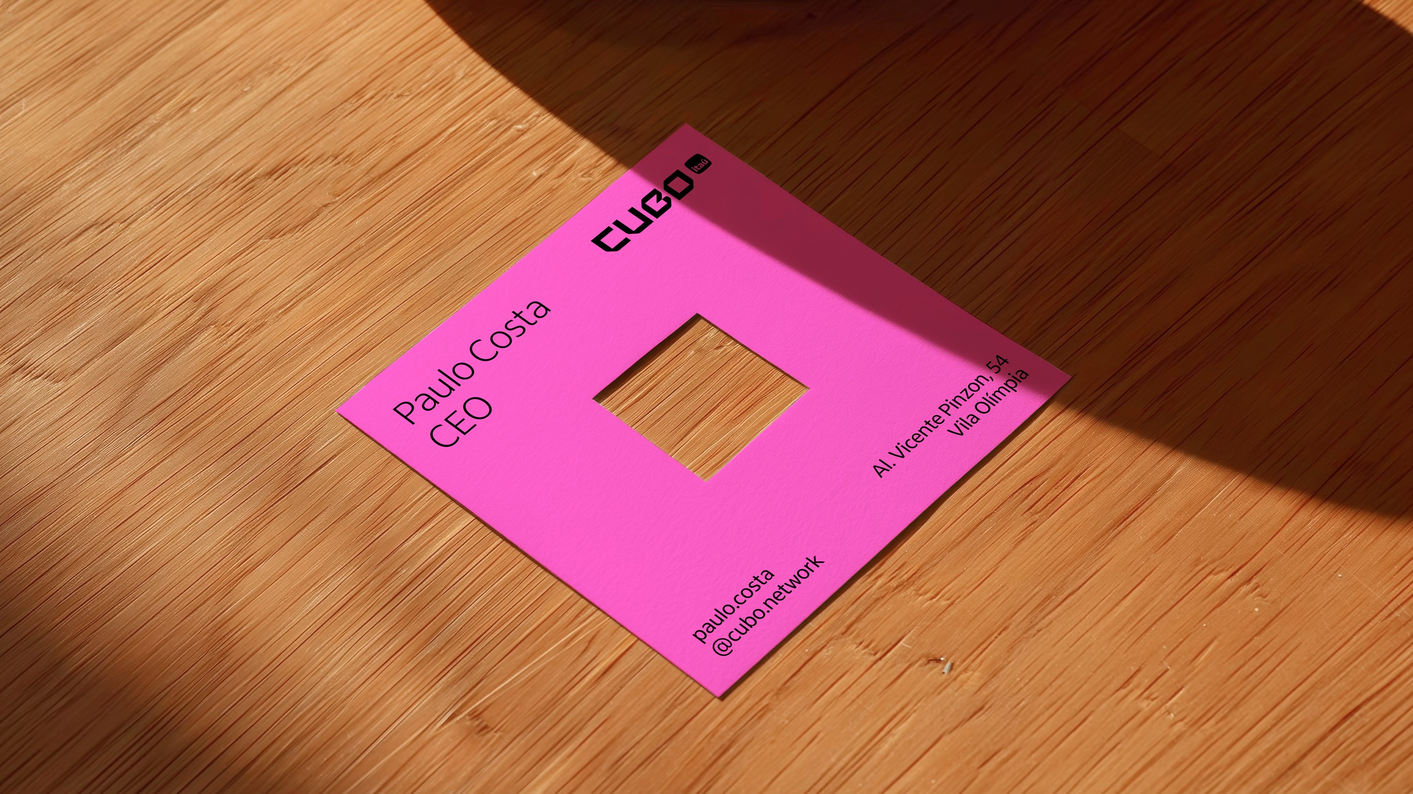
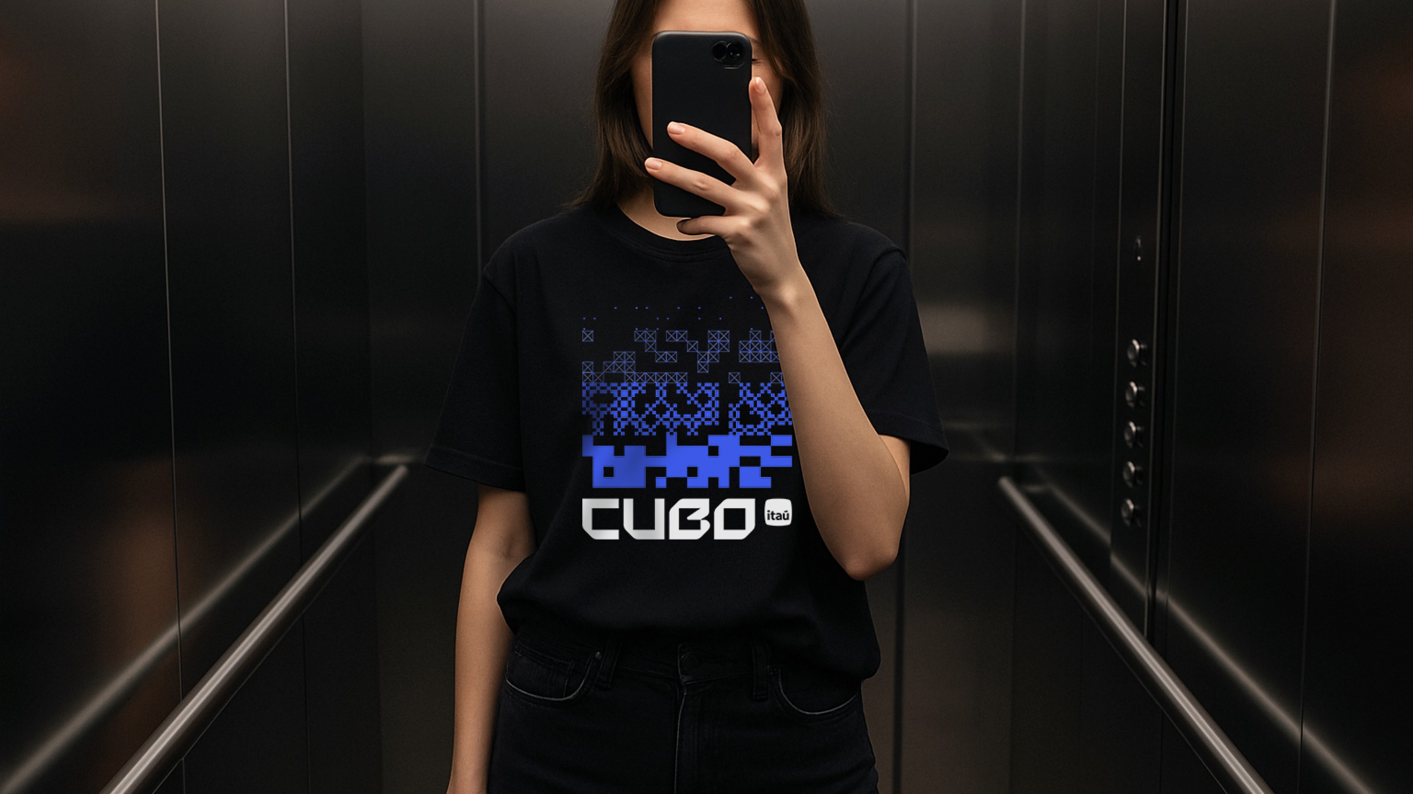
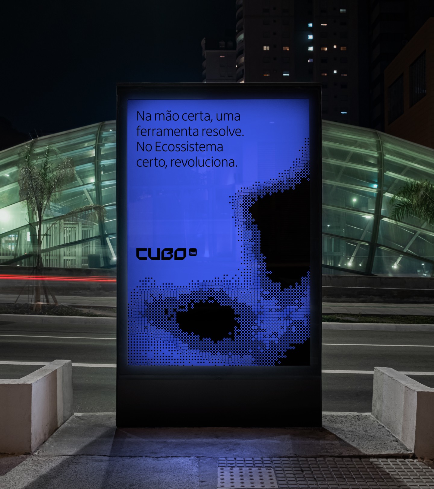

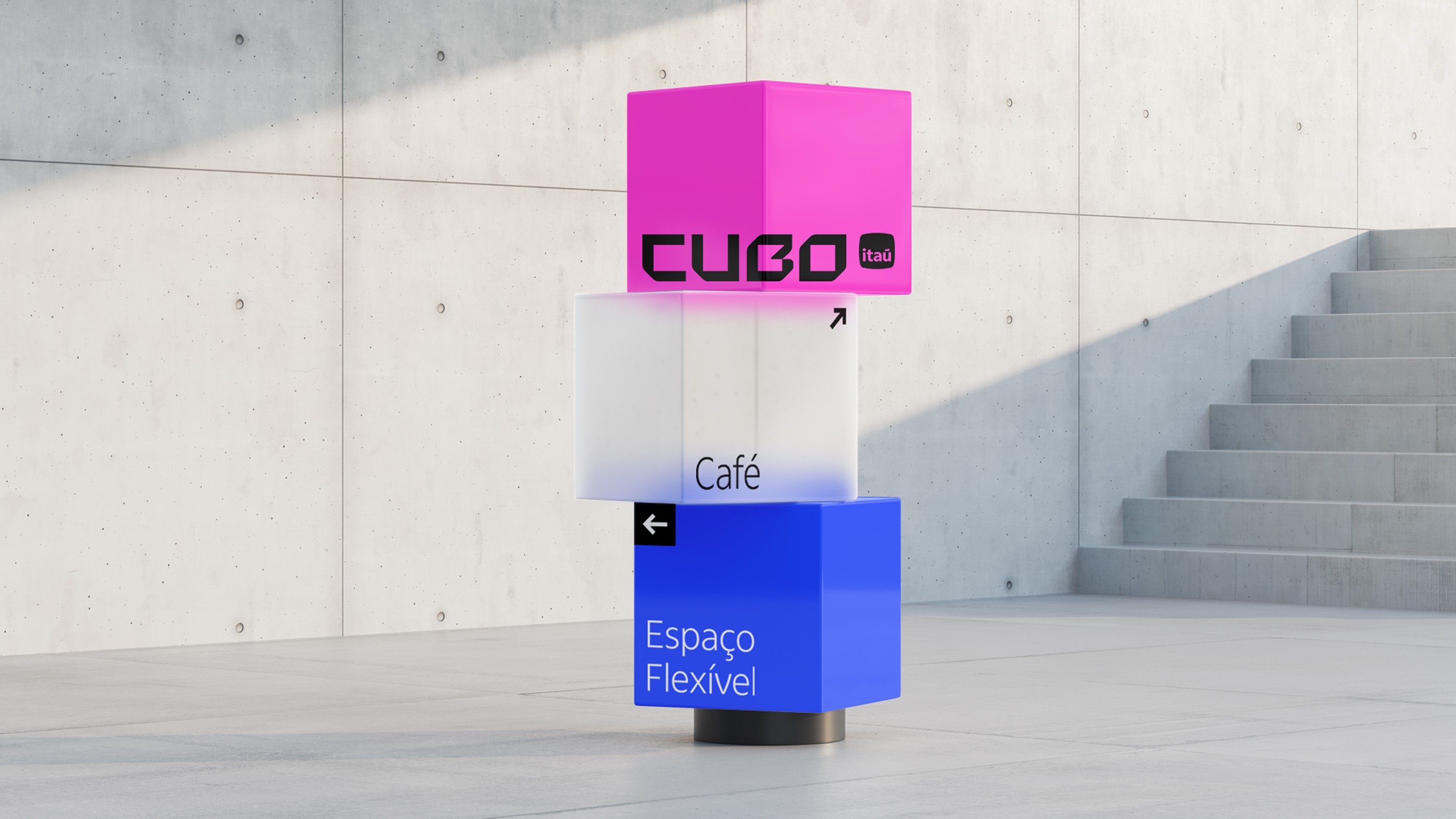
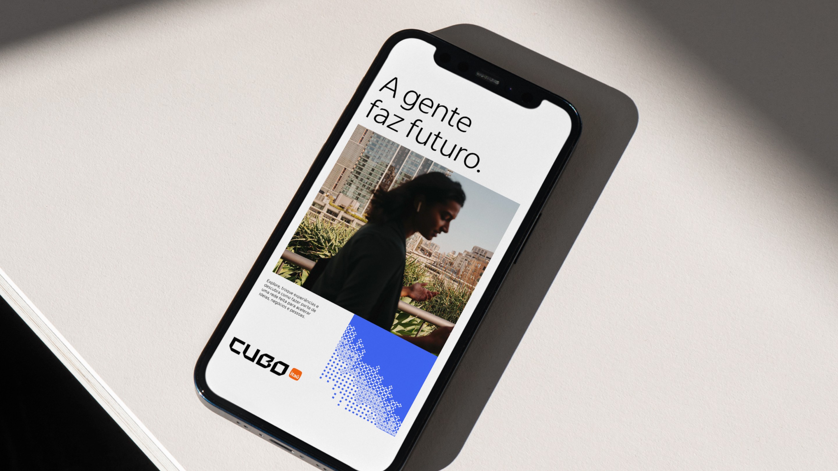
Cubo Itaú turned 10 as one of the leading innovation and tech entrepreneurship ecosystems in Latin America. What began as an open innovation hub became a platform that connects startups, investors, and large corporations, continuously expanding the number of members, hubs, and initiatives under its management. Reaching its first decade, the brand needed to reflect that strategic maturity.
Colírio led the complete rebranding of Cubo Itaú, covering strategic positioning, visual identity, logo redesign, an integrated graphic system, motion design, and visual architecture for digital environments. The project was developed in São Paulo and published in September 2025.
The process followed an open branding methodology: more than 30 interviews with the community, leadership, and strategic stakeholders. That listening shaped a new positioning, Cubo as an "engine of futures", redefining its role in the Brazilian innovation ecosystem. Not just a space for connection, but a structuring force behind economic and technological transformation.
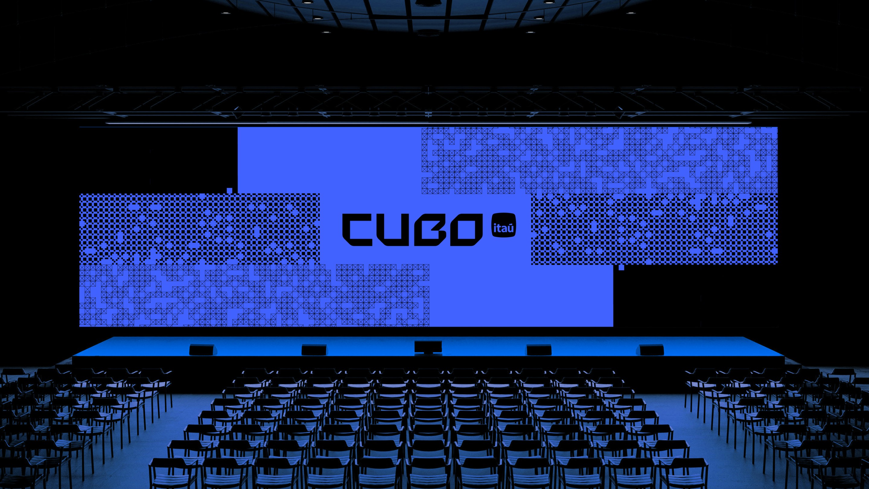
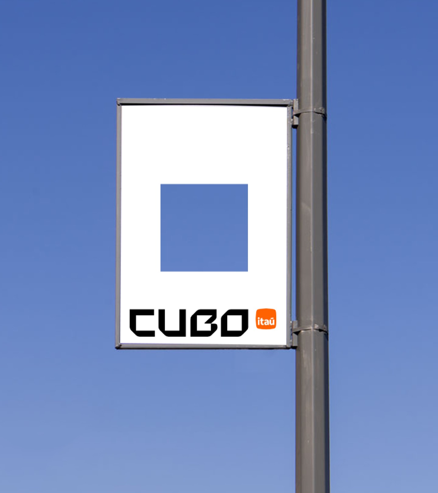
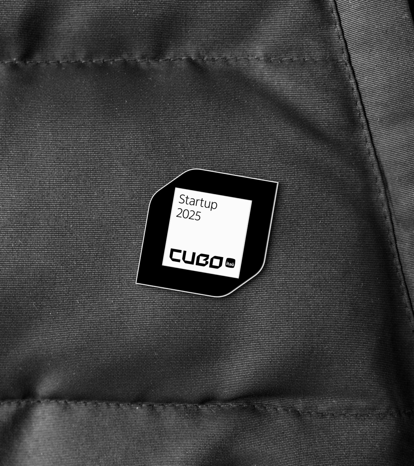
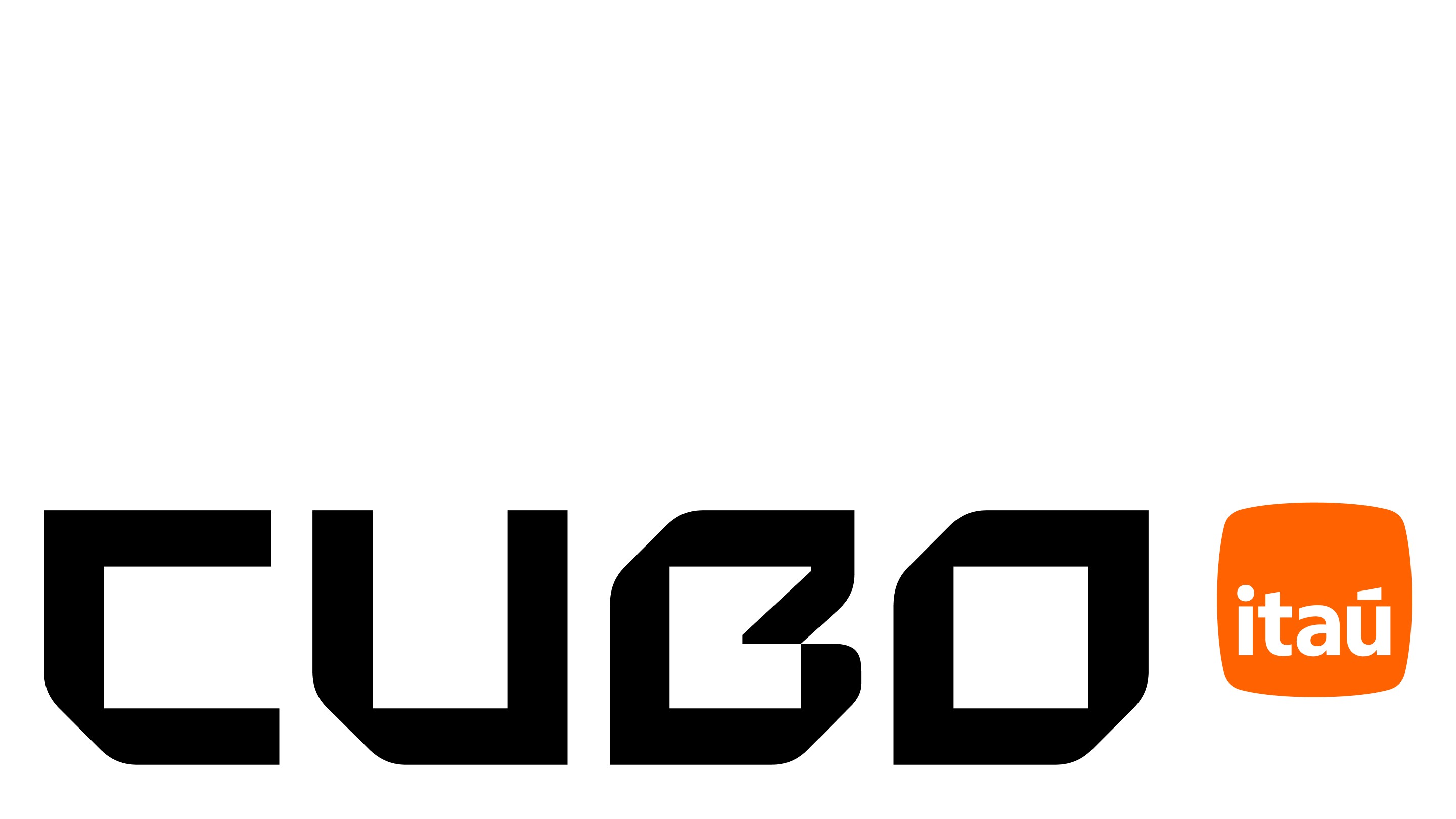
The logo redesign translated the name itself into typographic logic: the square as the fundamental unit, structuring the outer contours and the inner spaces of the letters. Chamfers on opposite corners introduce visual tension and suggest perspective, connecting the two-dimensional plane to the three-dimensionality implicit in the concept. The result is a logo with structural rigor that works as the architectural blueprint of the whole identity.
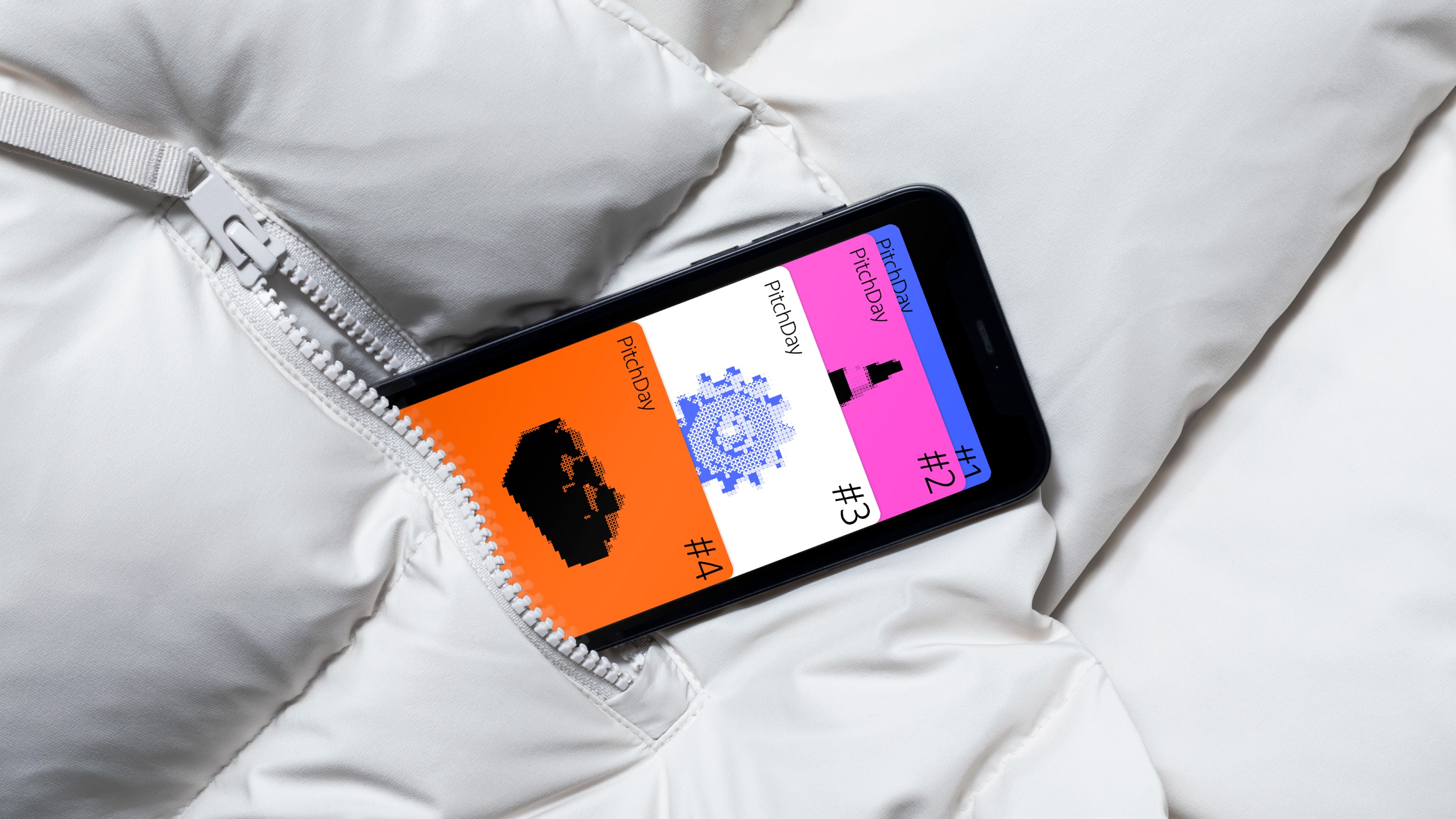
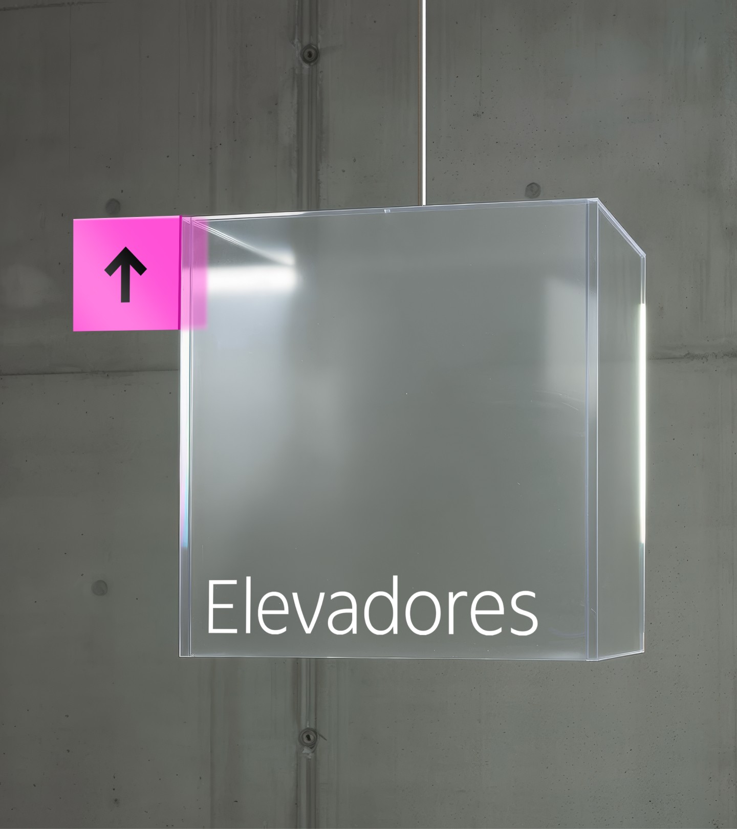
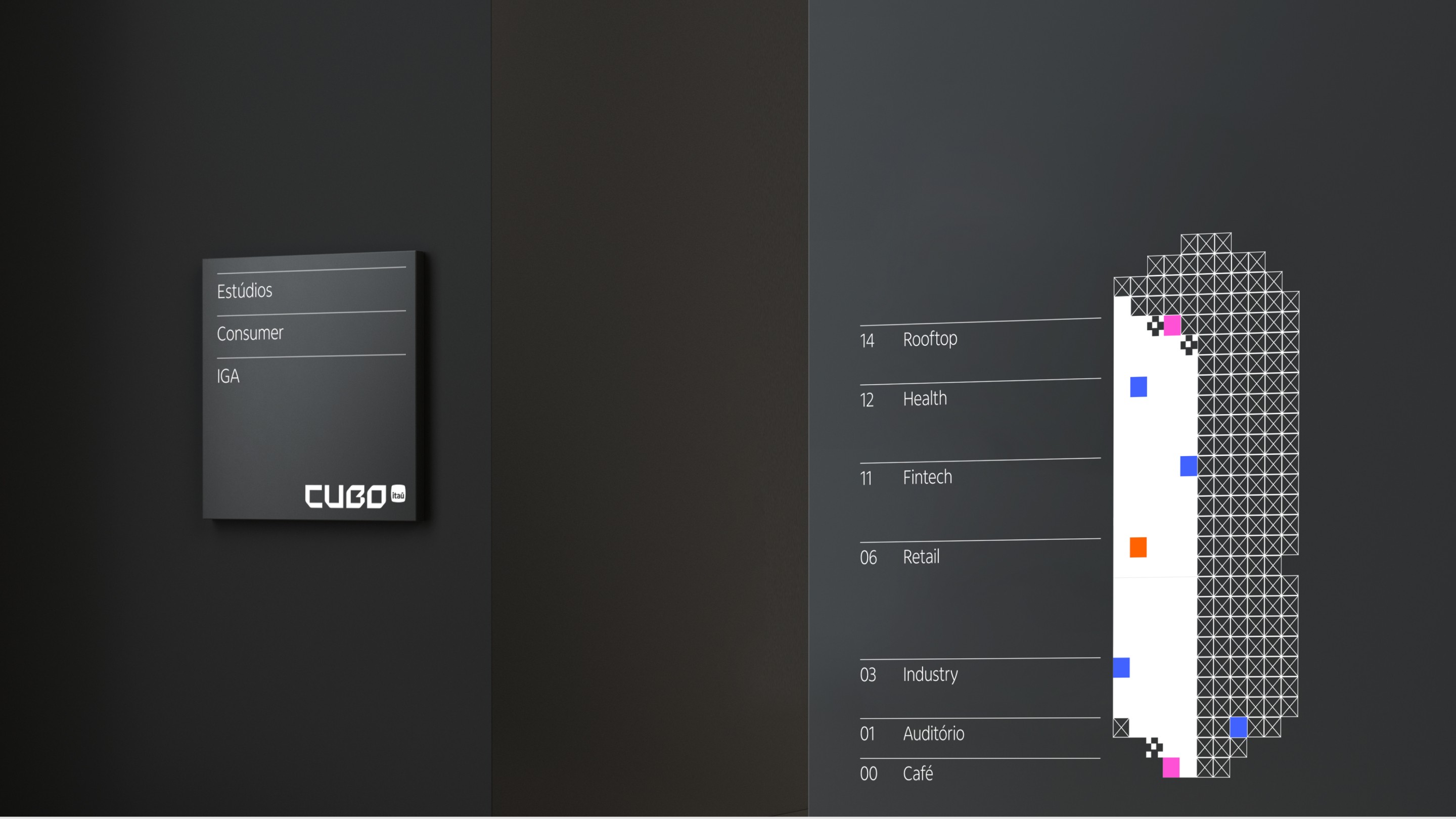
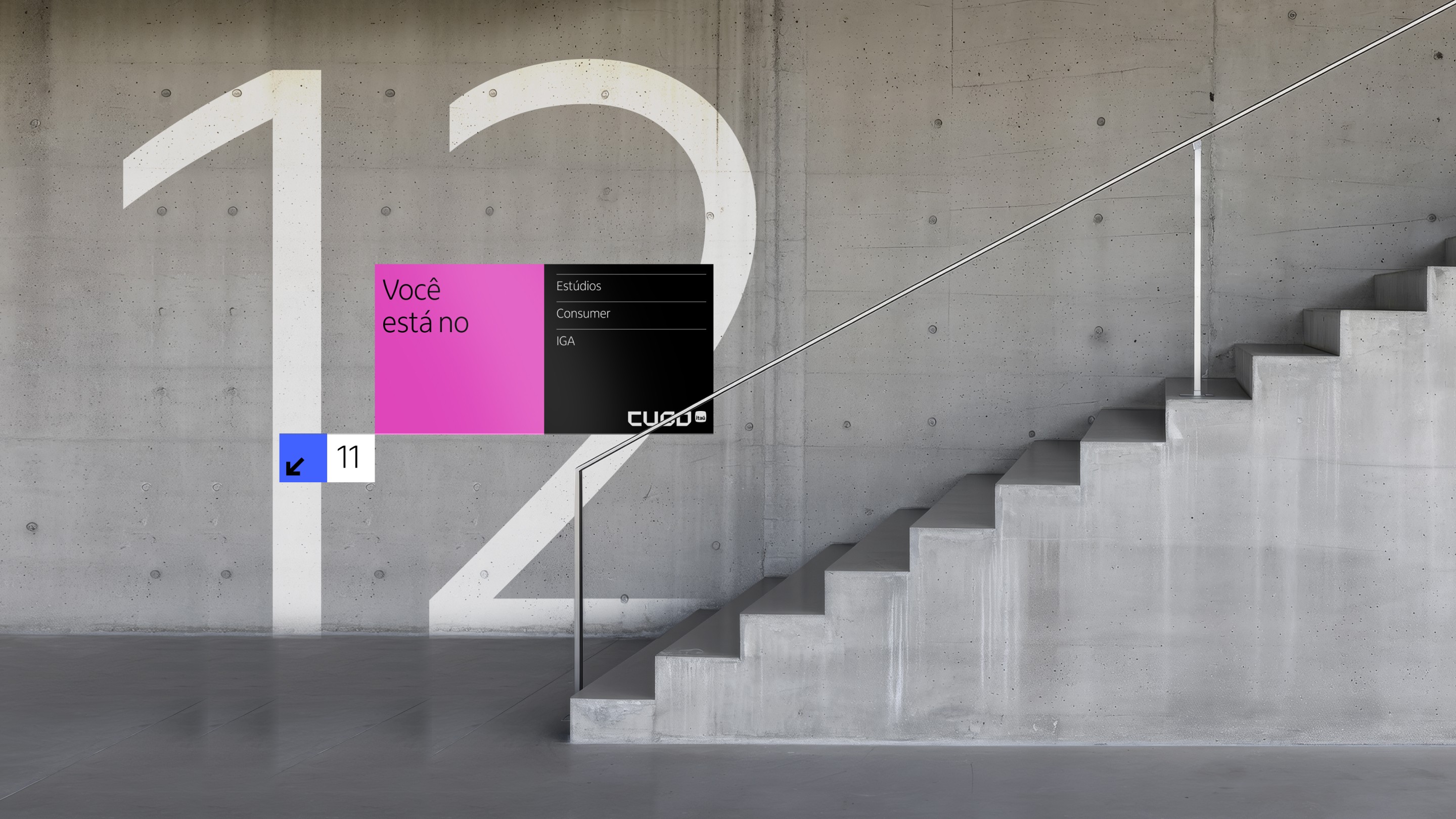
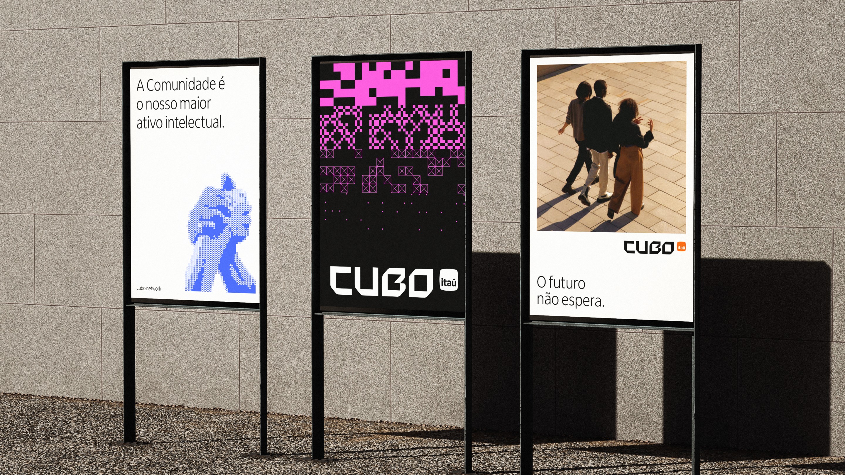
The graphic system was developed as a modular language: grids and clear geometric principles that organize compositions, framing, and typographic hierarchies across multiple formats and contexts. Institutional communication, events, digital platforms, and physical spaces now run on the same logic, ensuring coherence without rigidity.
Motion design was conceived as a behavioral extension of the positioning, not as an aesthetic add-on. The motion grammar is based on rotation, layering, depth, and modular displacement. The square reveals three-dimensionality in movement, suggesting architecture in formation. The system can be replicated and governed, with applications in video openings, social media, institutional presentations, and digital activations.
For digital environments, the identity was structured with parametric, generative logic: modules that recombine, expand, and reorganize within clear formal limits, allowing consistent variations without depending on manual intervention. A system prepared to work with automation and artificial intelligence, and to scale along with the ecosystem.
The Cubo Itaú rebranding is a complete brand identity project developed by Colírio Design in São Paulo, integrating strategy, graphic design, typography, motion design, and digital visual systems for one of the largest innovation ecosystems in Latin America.
Credits
…
" height="12px" id="naZLPfQHn" transform="translate(-1 0)" width="13px"/></svg>)