Clash
A new look at masculinity.
About
Client
Clash - O Boticário
Scope
Strategy
Visual Identity
Verbal Identity
Packaging
Clash is a perfume brand created for O Boticário with the purpose of representing a new look at masculinity. The branding project started from the idea of friction between past and present, between rigidity and fluidity, to build a verbal and visual identity that is aspirational and authentic. The Clash brand carries this positioning to every touchpoint: naming, narrative, visuals, packaging, and campaign. The result is a brand with a clear purpose, symbolic language, and emotional appeal, one that challenges the segment's traditional codes and broadens representation in perfumery.
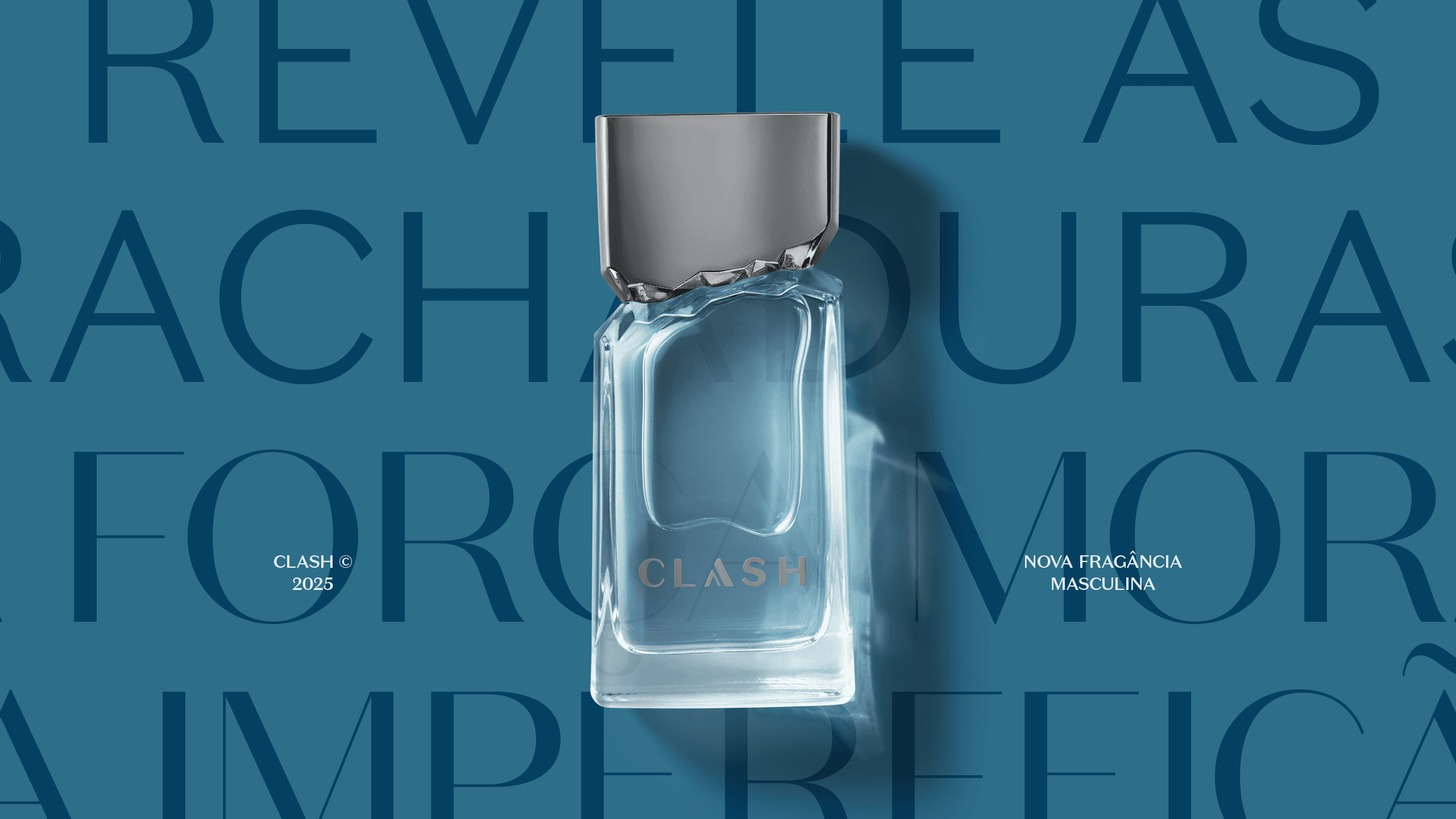
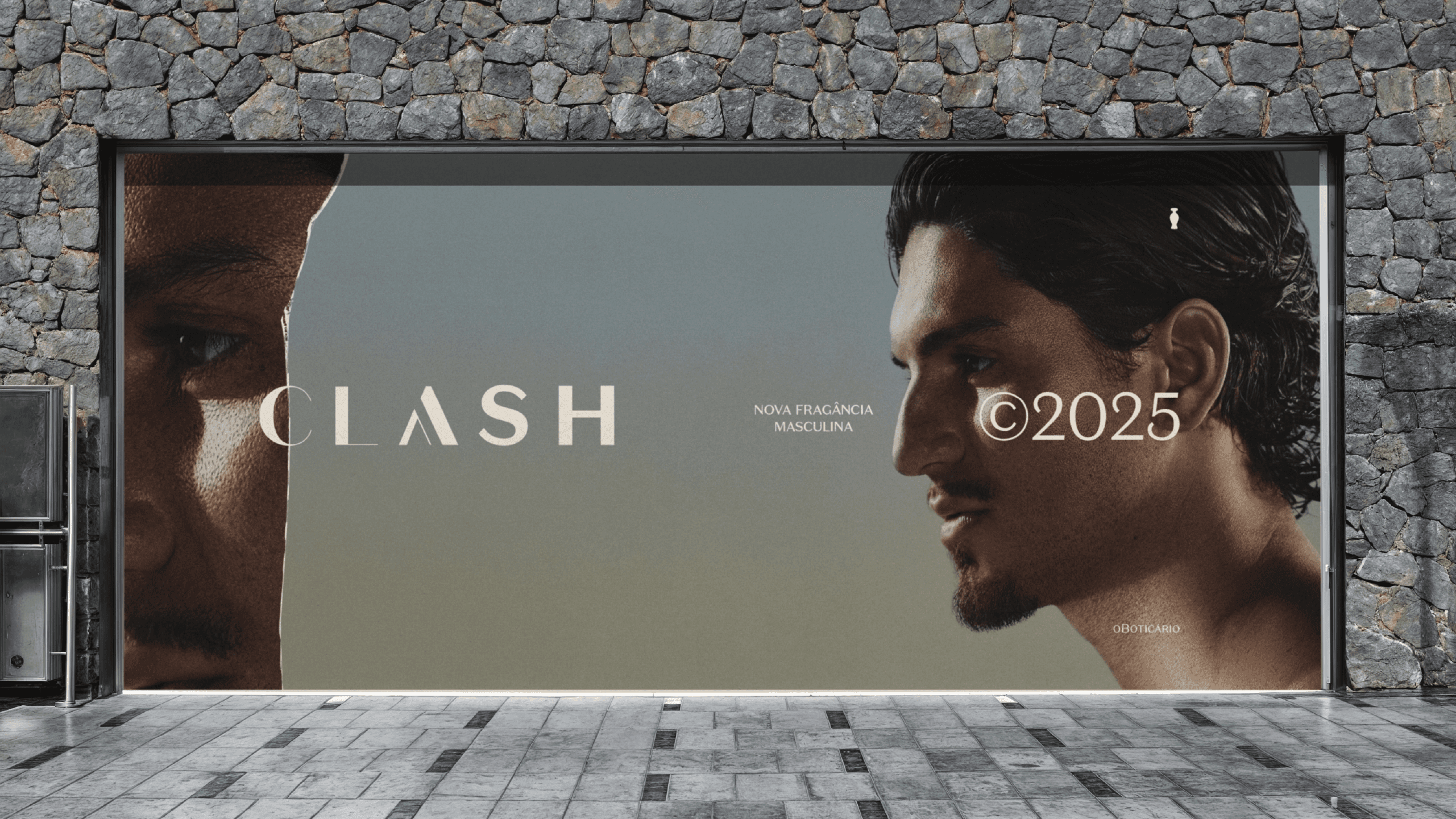

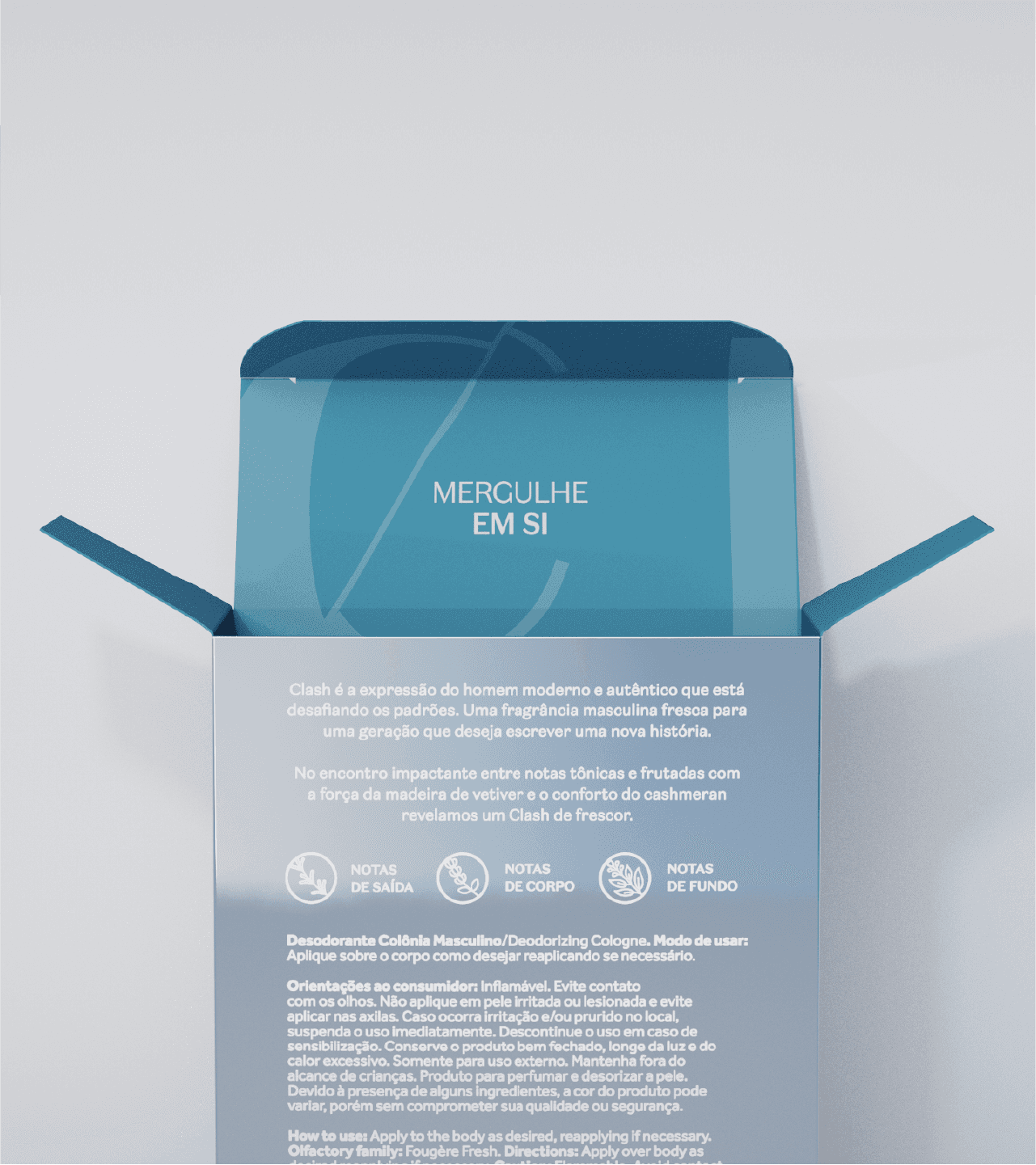
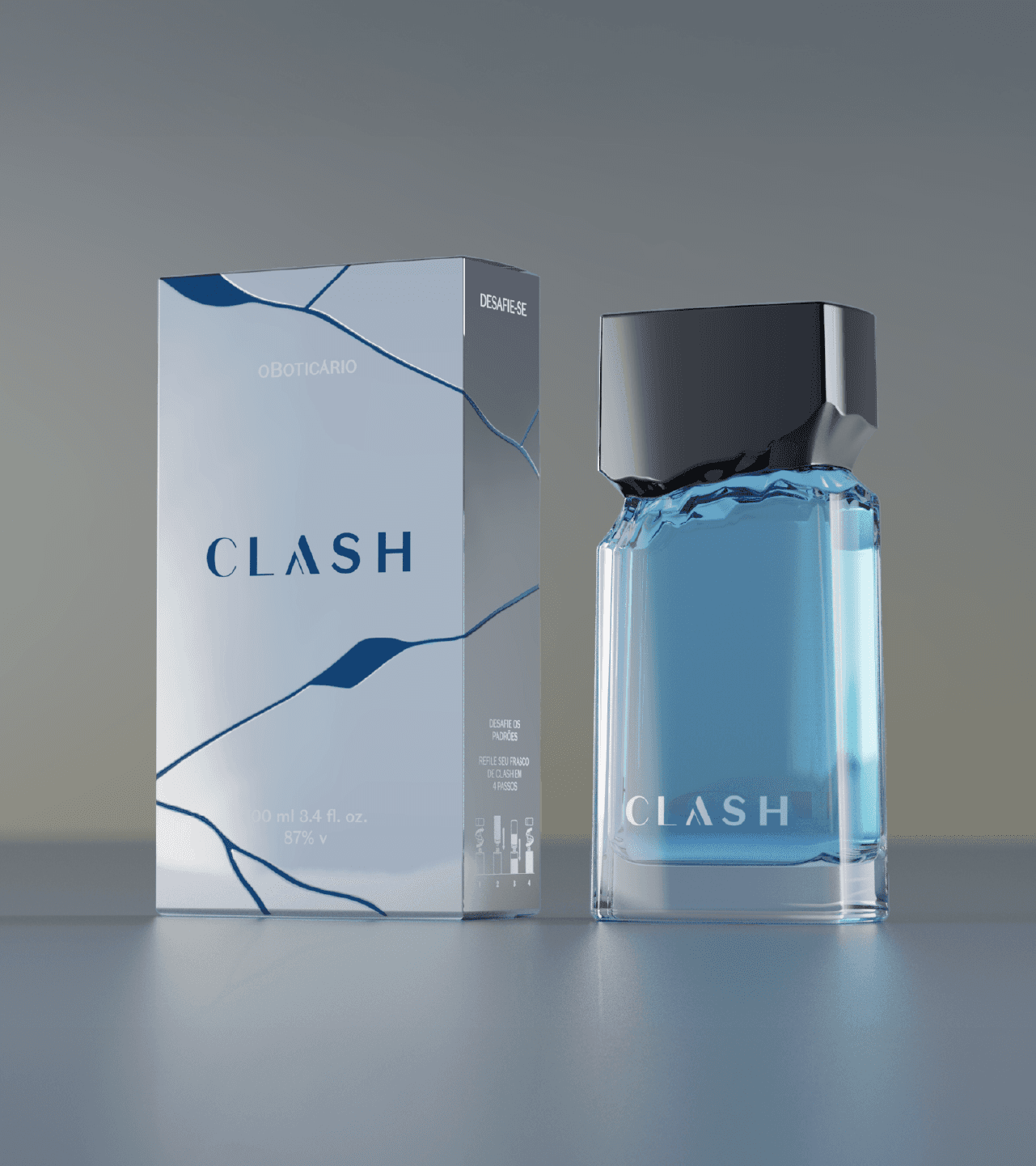
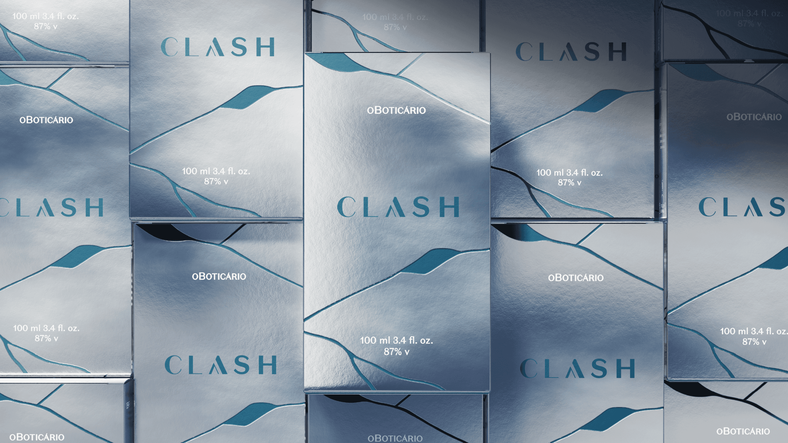
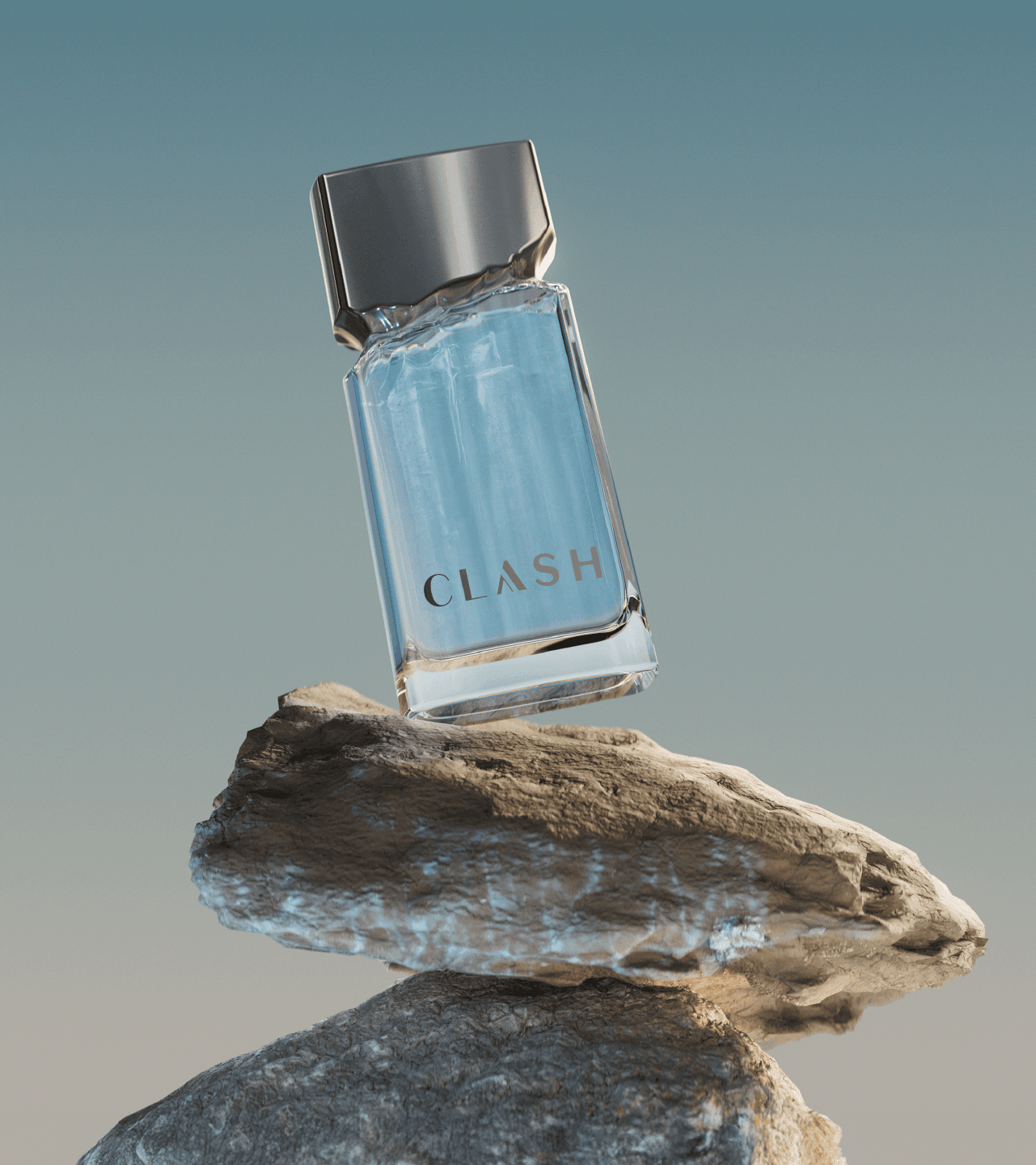
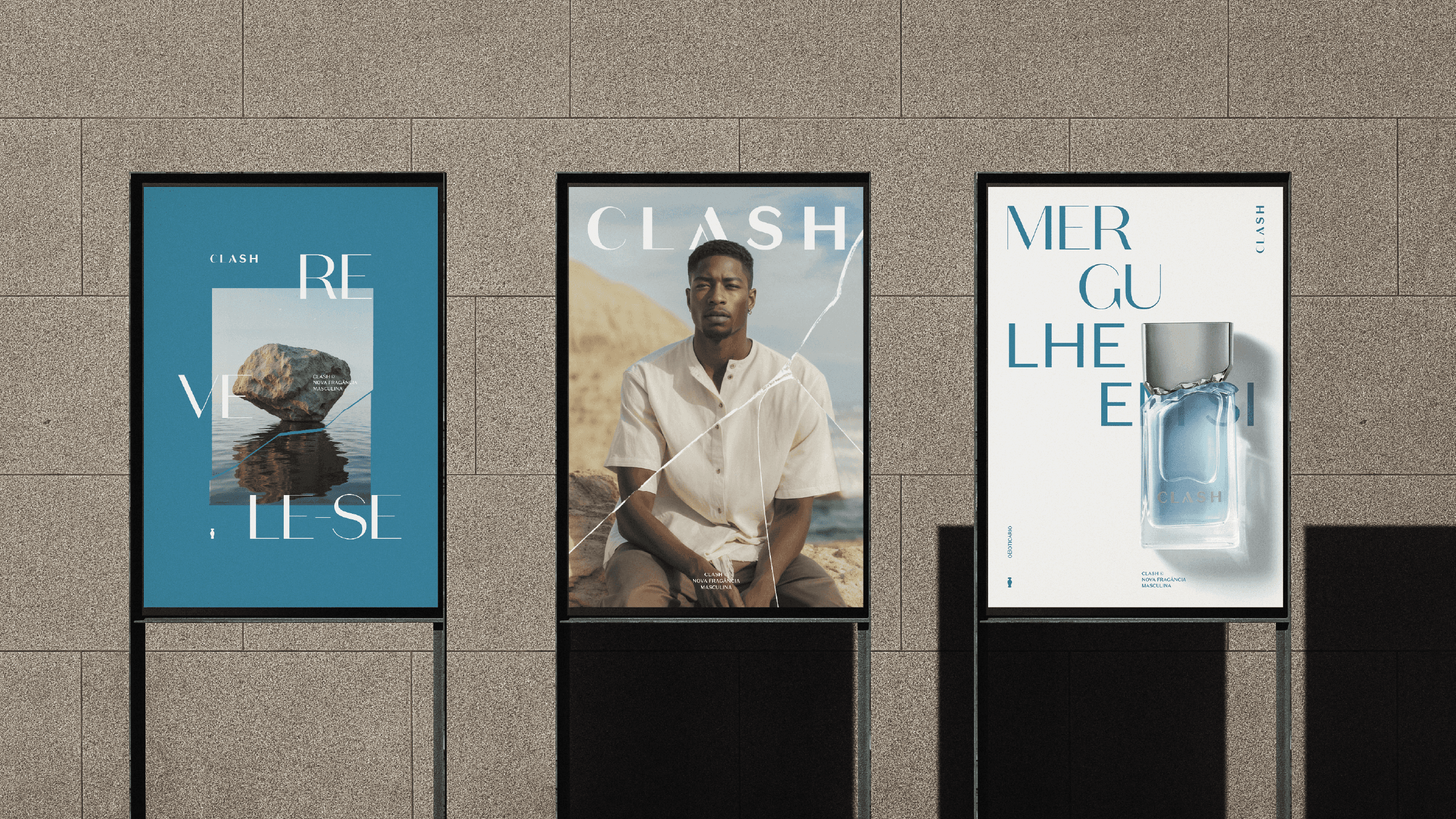

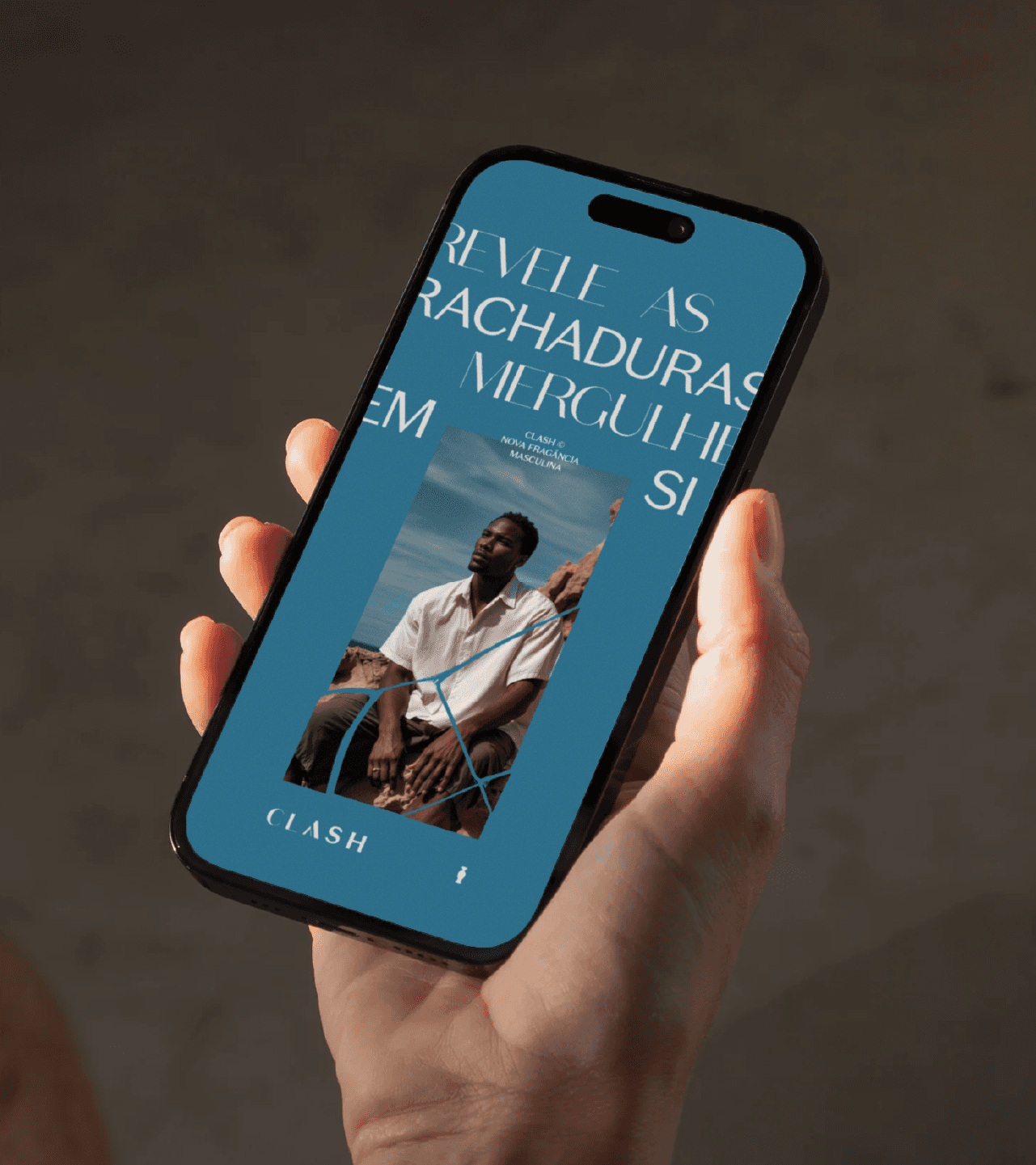
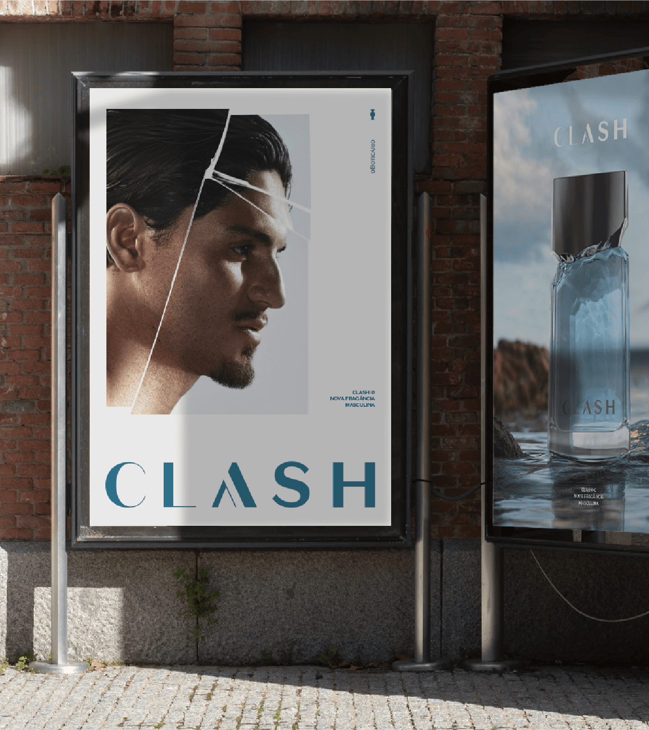
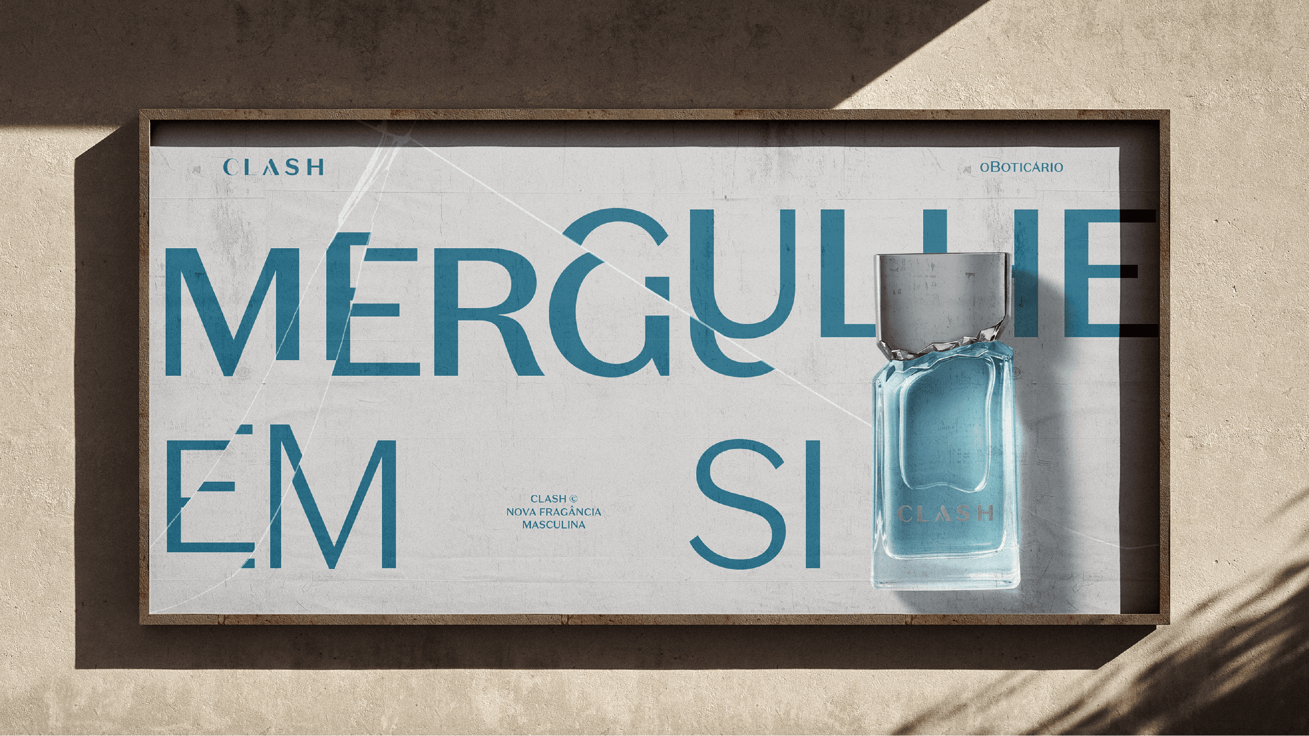
Clash is a perfume brand created for O Boticário with the purpose of giving men's perfumery a new meaning. The project was developed by Colírio Design in 2025 and covered complete branding (naming, strategic positioning, verbal identity, visual identity, packaging, and campaign) for one of the largest beauty and cosmetics companies in Brazil.
The starting point was cultural. The men's perfumery market carries visual and narrative codes that have been set for decades: strength, virility, and stereotypes of masculinity. The brief asked for the opposite: a brand that would make room for a masculinity in transition, plural and authentic, able to connect emotionally with a new kind of male consumer without giving up aspirational appeal.
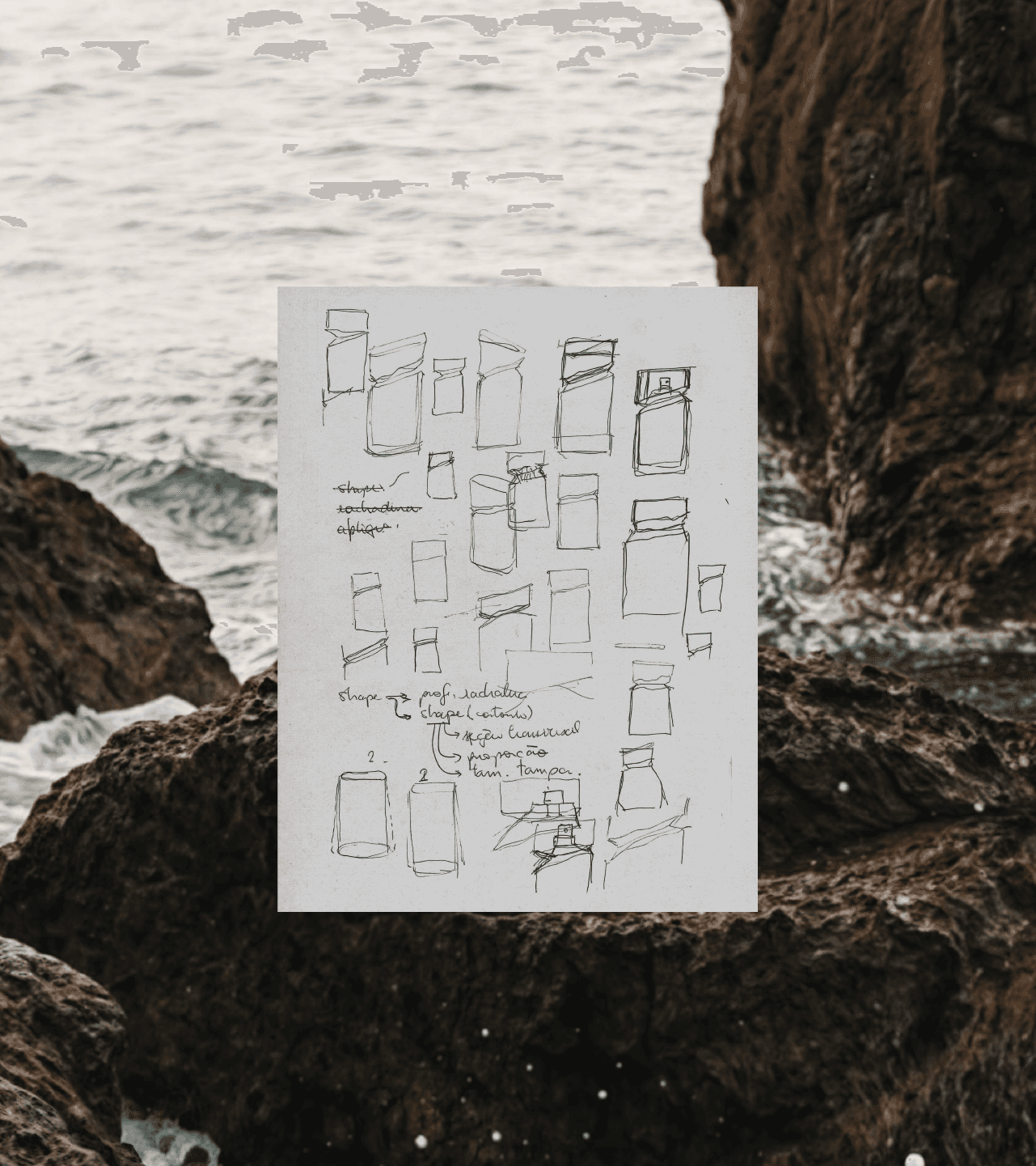
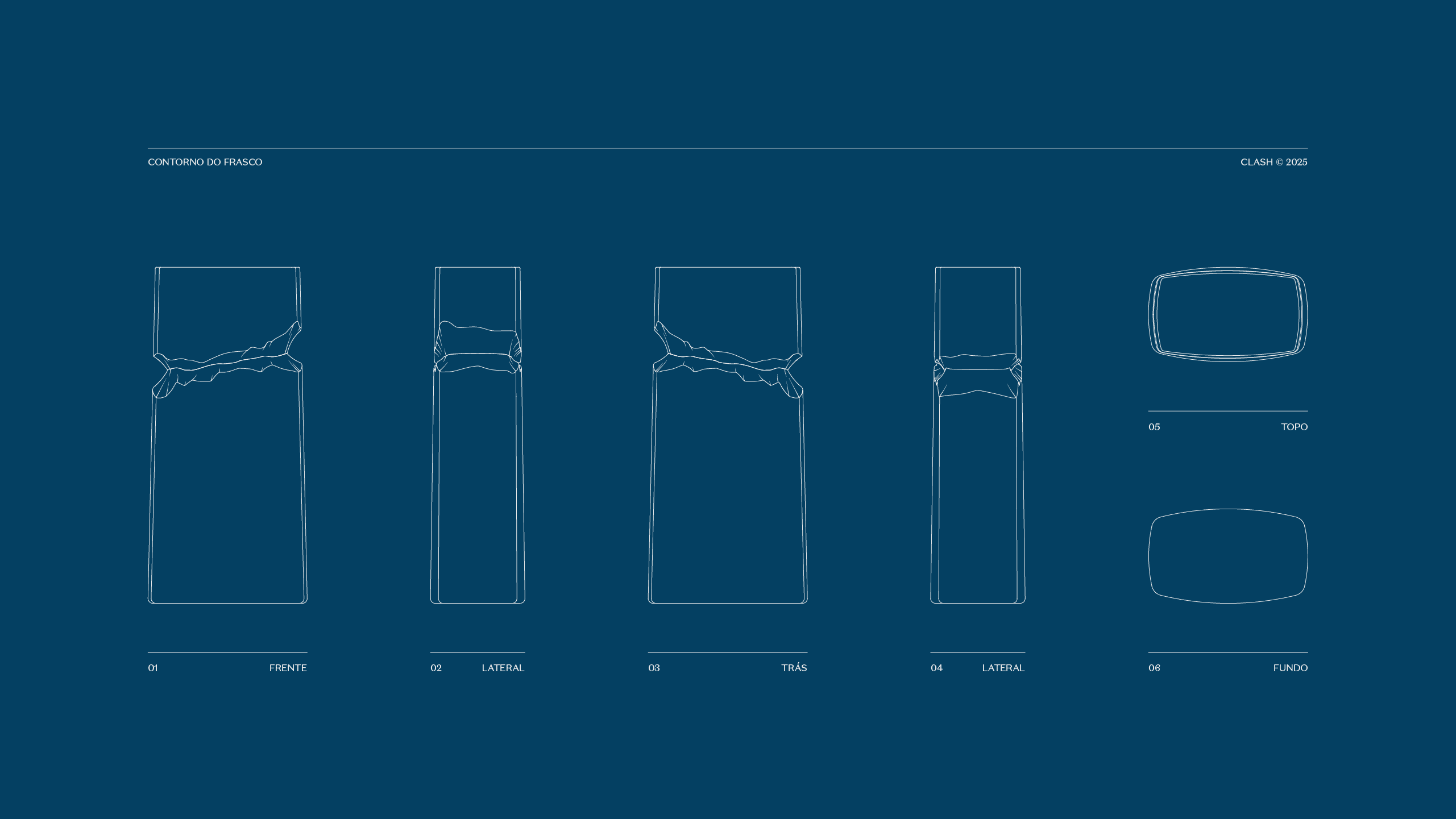
The concept was born from friction. Clash starts from the tension between opposites (past and present, rigidity and fluidity, stone and water) to build an identity that embraces imperfection as a symbolic strength. The name carries that clash. The brand narrative was built from cultural and behavioral studies, translated into naming, storytelling, and a tone of voice with a clear purpose.
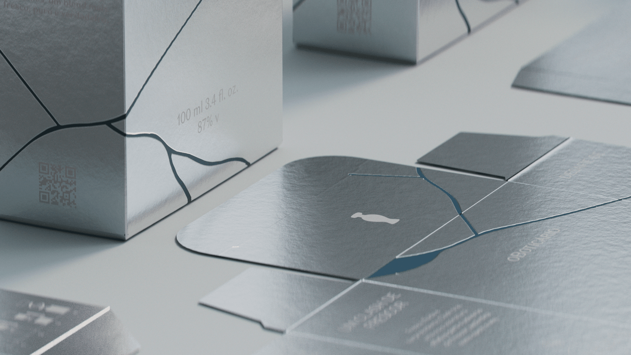
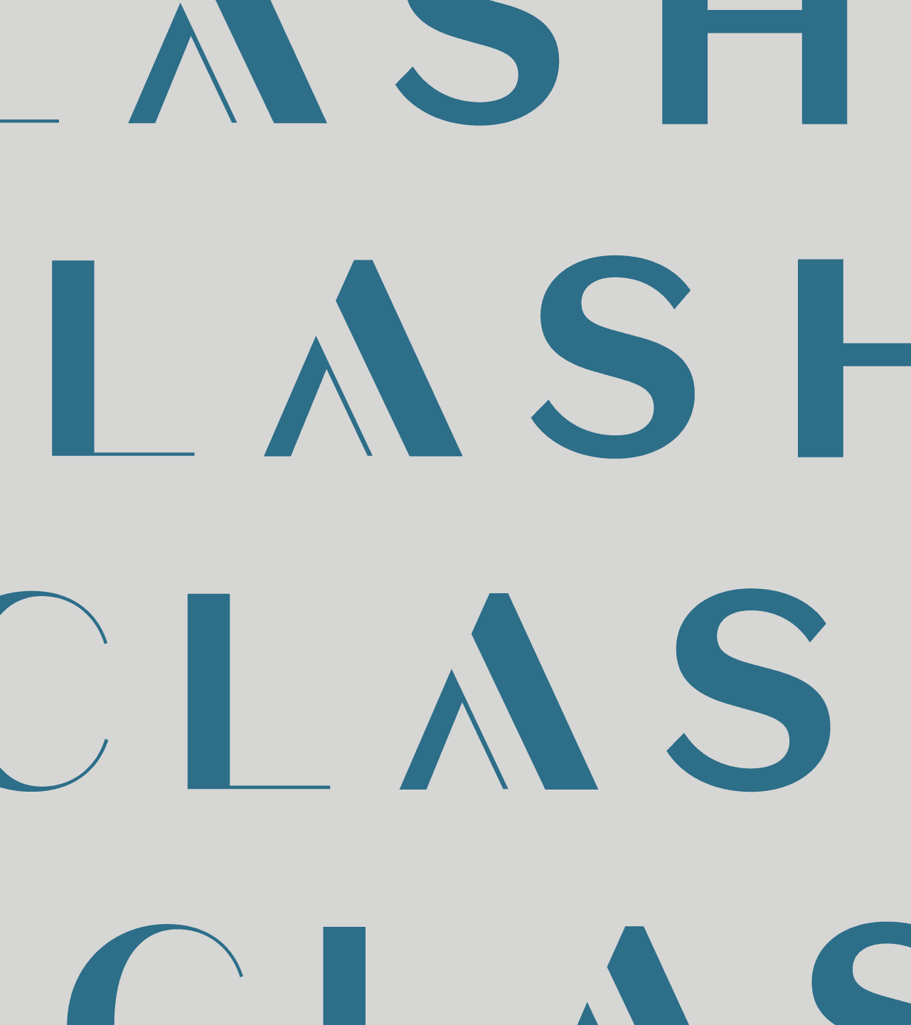
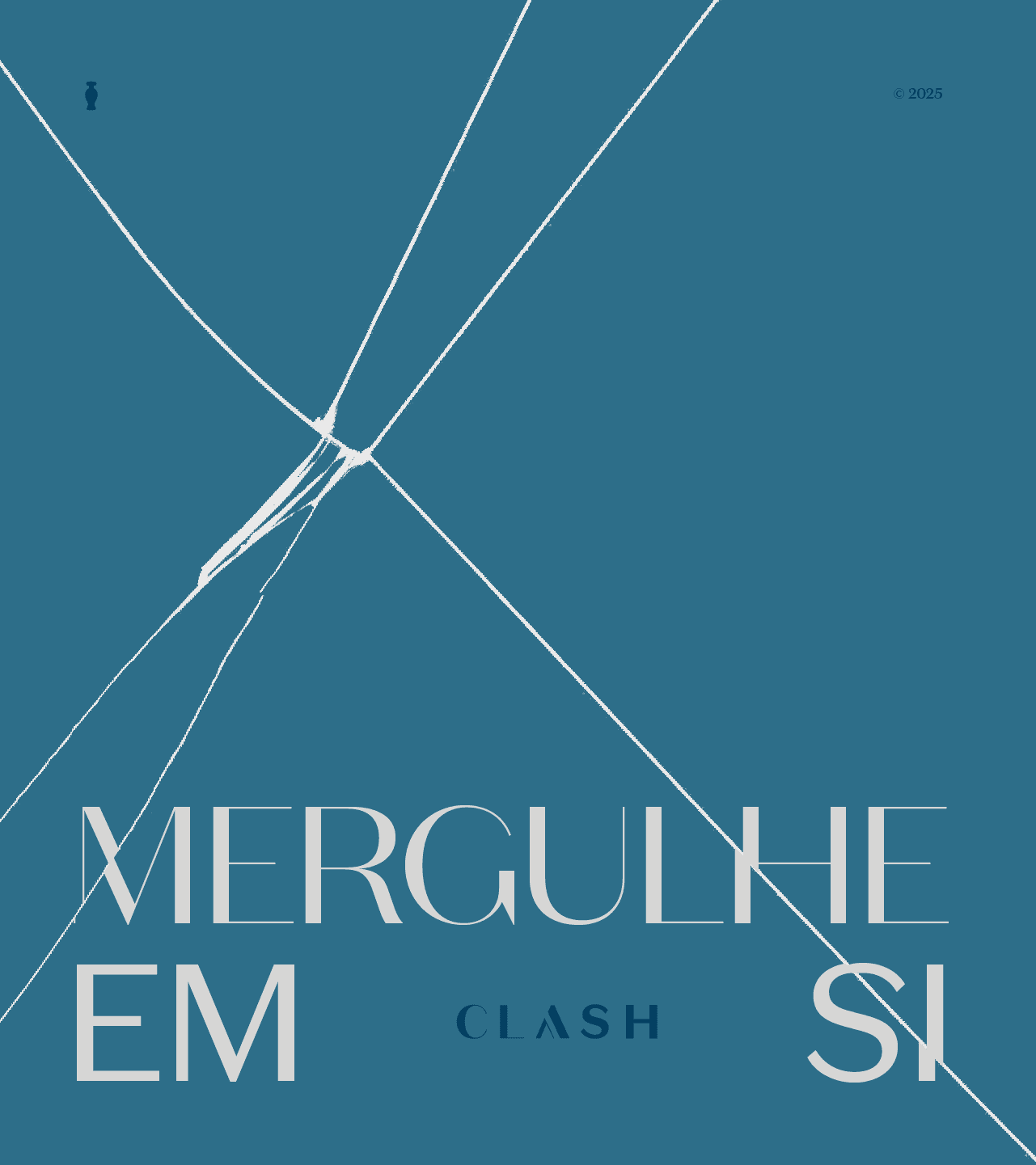
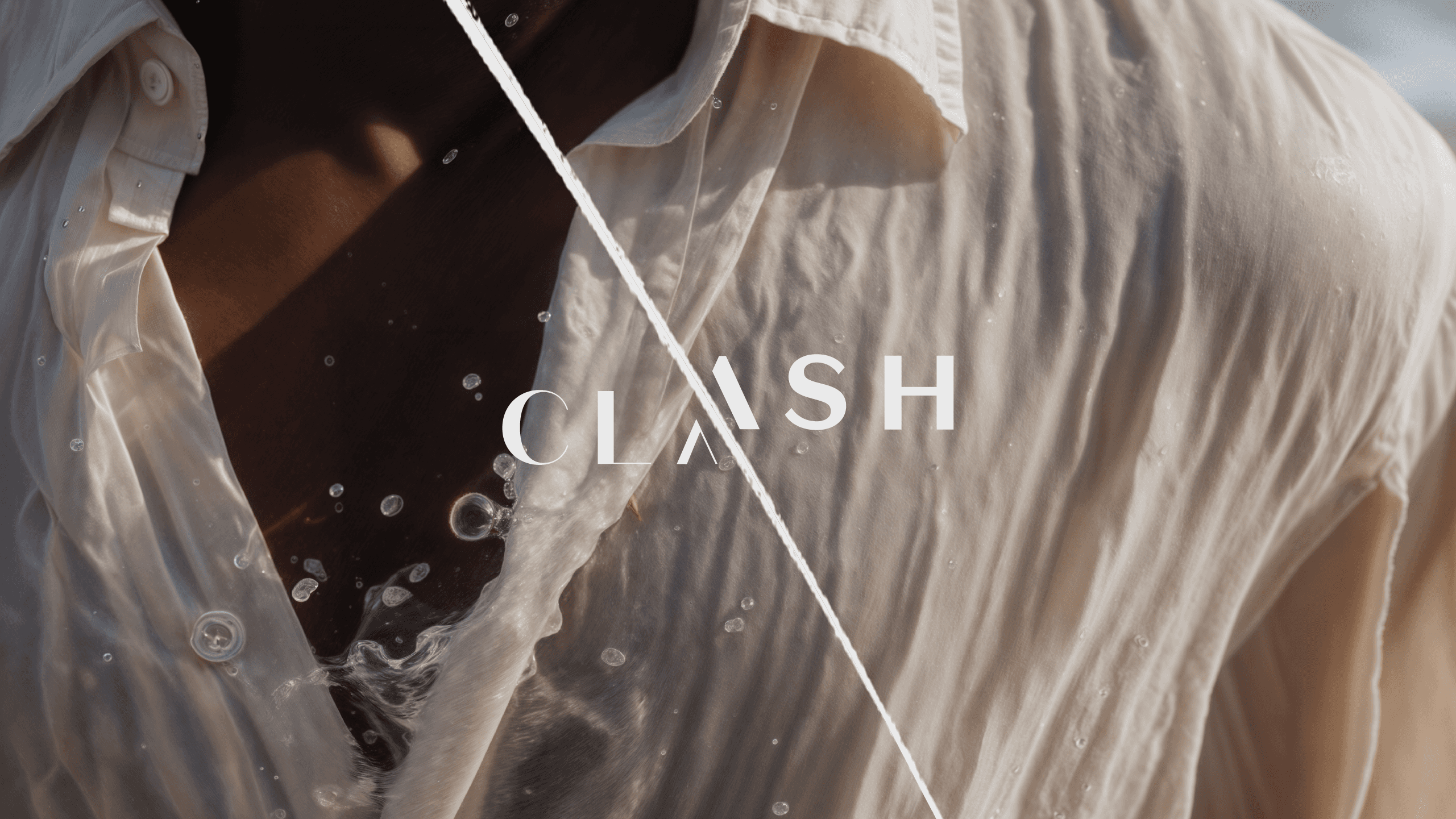
The visual identity follows the same conceptual logic. The typography was developed with irregular cuts that evoke a broken mirror and the deconstruction of patterns. The palette combines aquatic and metallic tones, balancing sensitivity and strength. Graphic elements inspired by water and stone run through the campaign materials, cartons, point of sale, and social media, creating visual tension and coherence across all touchpoints. The graphic system is fragmented and fluid, not linear, breaking with the category's aesthetic predictability.
The result is a brand with symbolic language, emotional appeal, and real differentiation in a saturated market. Clash positions itself as a milestone in the Boticário portfolio: a men's brand that is less prescriptive and more representative, and that uses graphic design and branding as tools for cultural and commercial positioning.
Colírio Design, São Paulo. Naming, branding, visual identity, graphic design, packaging, and campaign.
Credits
Victor Garcia
Bernardo Yono
Rafael Mesquita
Leonardo Tavares
Verônica de Oliveira
Leo Massarelli
Barão Di Sarno
João Costa
Camila Capeletto
Danielle Tubino
Renan Santa Terra
" height="12px" id="naZLPfQHn" transform="translate(-1 0)" width="13px"/></svg>)